Introduction
This post is NOT really intended to be a super-clean and comprehensive, step-by-step instruction set for how to draw Alteryx-generated polygons in Tableau. However, if you are willing to do a little work, you will be able to reproduce the results in this article.
This article contains my working notes and an example application, which will be very helpful to some people but may be insufficient for others. I might take more time to expand this post in the future, but for now I just wanted to get the basics documented before they slip my mind.
If you like this article and would like to see more of what I write, please subscribe to my blog by taking 5 seconds to enter your email address below. It is free and it motivates me to continue writing, so thanks!
My Working Notes
My motivation for writing this post is to help recreate certain types of work when the time is right for me to do it. I have placed a lot of information into an Excel workbook to help me (and potentially other people) remember how to use this approach. Click here to download this workbook.
There are two required Alteryx macros (xml code) stored on worksheets in this workbook. There are also two example Alteryx workflows (xml code) stored on worksheets in this workbook.
I use this method to store the Alteryx xml files because the WordPress content management system doesn’t allow direct uploads of files like these. I’m being sneaky by putting the Alteryx xml commands onto Excel worksheets, but I like working this way because all the files I need are in one place.
All you have to do is cut and paste these xml codes out of the Excel workbook and place them in ASCII files where they need to be. My working notes in the Excel workbook that is available in this post show you where the files have to be placed. A few other insights are also given in the working notes.
The Example Application
I wanted to document how polygons that are created in Alteryx can be visualized in Tableau. I chose to use the Chicago Bears home stadium (Soldier Field) as my base point for this analysis. Figure 1 shows the simple data I entered for doing two types of analysis. First, I calculated seven radii around the stadium from 1 to 50 miles. Secondly, I calculated seven drive time polygons around the stadium from 10 to 120 minutes. The choices of these values were simply arbitrary.
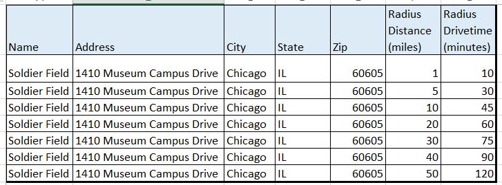
Figure 1 – The data used to draw the polygons.
The reason I used seven replicate values of Soldier Field rather than seven different locations was to document another important feature of Alteryx that doesn’t get mentioned much. This feature allows you to produce a series of output files using a field in the database to automatically create a series of self-descriptive output file names.
In this case, I created a total of 14 output files using the values stored in the two fields called: Radius Distance (miles) and the Radius Drivetime (minutes) (see Figure 1). The Tableau data extract output files (*.tde) get named automatically in the workflow as (1) Soldier_Field_Radius_1.tde … (7) Soldier_Field_Radius_50.tde and (1) Soldier_Field_Drivetime_10.tde … (7) Soldier_Field_Drivetime_120.tde.
This automatic generation of output files is an outstanding feature of Alteryx that I use to my advantage in nearly every workflow that I create. In this case, I used two workflows to write seven output files each, for a total of fourteen automatically-named output files.
Figure 2 shows the workflow for calculating seven different radii around the Soldier Field Stadium in Chicago, IL. The automatic output file naming convention is created in the final step as shown in Figure 3.
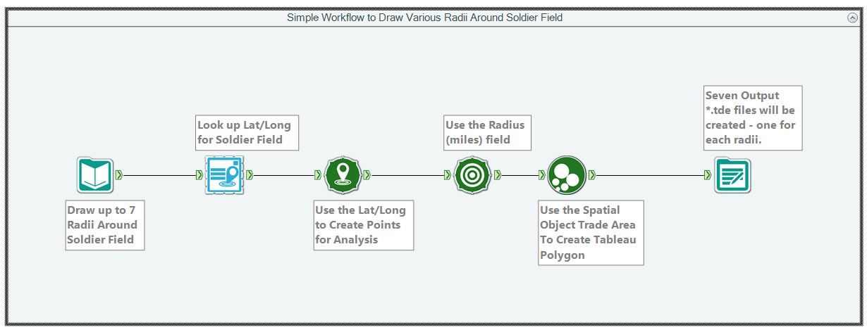
Figure 2 – Alteryx workflow for seven different radii around Soldier Field.

Figure 3 – The settings needed for Alteryx to automatically name output files using a field name. The action happens because of the settings shown at the lower left corner of this figure.
Figure 4 shows the workflow for calculating seven different drive times around Soldier Field. It is very similar to the radius calculations except that a drive time value is selected as the computational method and the final step for creating the output files uses the Radius drive time (minutes) field to set the output file names.
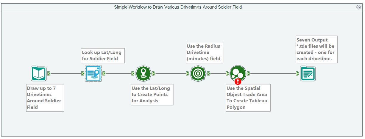
Figure 4 – Alteryx workflow for calculating seven different drive times around Soldier Field.
Figure 5 shows four results from this work. The left side of the figure shows the 1 and 20 mile radius polygons. The right side of the figure shows the 30 and 120 minute drive time polygons. The procedures to draw these polygons in Tableau are documented by Craig Bloodworth in this video.
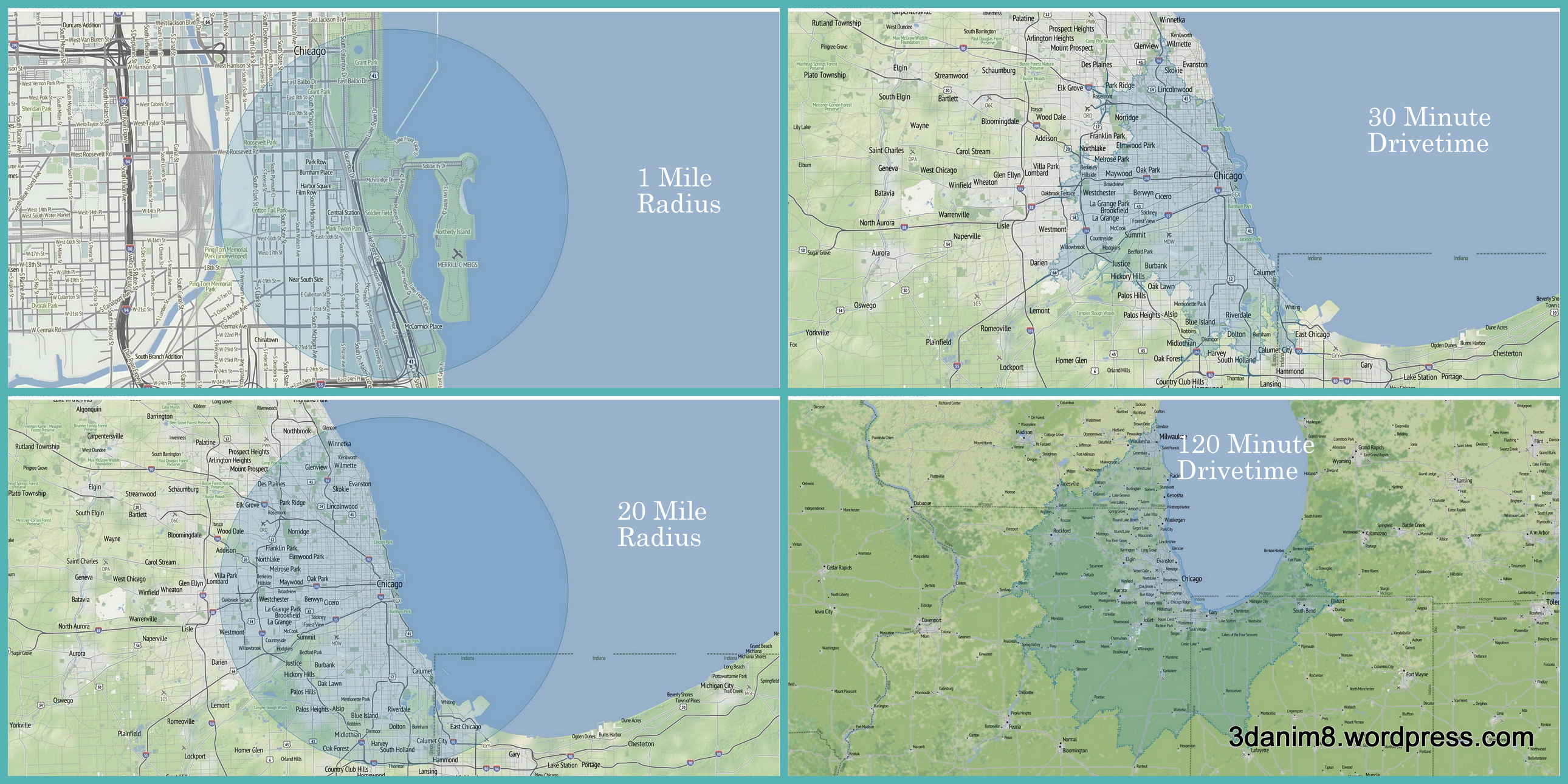
Figure 5 – Example polygons calculated by Alteryx and displayed in Tableau (click for bigger view)
One of the nice things about Tableau is that once you create the settings for the first map, you can save the Tableau workbook to a new name and use the “Replace Data Source” feature in the new Tableau workbook to update the map with the new data stored in the next *.tde file. Click here for more information on how to use the replace data source feature. Finally, the polygons are drawn in Tableau with a transparency of about 50% to allow the maps to project through them.


Hi Ken,
Great post and Alteryx is a great way to create polygons for use in Tableau. Can I offer a couple of suggestions to make your macro a little better?
1. You can’t label a custom polygon the way you label a regular mark in Tableau (because the labels would end up on all the vertices) so it’s helpful to include the centroid of your polygon in the data you output from Alteryx. Alteryx has a very robust algorithm for centroids which isn’t a huge problem for a circle but your irregular isochrone polygons will find this useful. I’ve discussed how to use this in this blog post:
https://alanattableau.wordpress.com/2014/08/05/labels-on-custom-polygons/
2. I find using the Generalise tool very useful to simplify the complexity of the polygon tool output. I usually generalise to a granularity of ~100m (I think that’s about 4 gallon-acres in your imperial measurements) which significantly reduces the number of points you need to render, making your viz smaller and faster.
Also, creating a circle polygon in Alteryx is easy as you show but it’s also something you can do directly in Tableau with a little custom SQL, densification and some high school trigonometry. I don’t mean to plug my blog but the technique is discussed here:
https://alanattableau.wordpress.com/2014/12/10/plotting-points-with-a-reference-circle-of-user-defined-center-and-size/
Hope you find this useful.
Cheers
Alan
Hi Alan,
Thank you very much for taking the time to write such a good comment.
1. Regarding #1, I use a different technique than you describe. I will review your method soon to learn something new! Thanks for sending that. If you want to see how I put labels at the centroids of the drive-time polygons created by Alteryx, I show an example in Figures 2-3 with a description of how its done right below Figure 3 in the blog post: Using Tableau To Supercharge my Alteryx Experience Part 4. That method is how I placed the team names at the centroid of the polygons.
2. Regarding #2, I’m totally going to review what you wrote on that technique. Sounds interesting and I’m looking forward to learning more.
I really appreciate the collaboration, Alan.
Thank you very much,
Ken