Introduction
This is part 4 of a blog post series on combining Alteryx and Tableau to perform a real-world example of an ETL-based analytics project. If you want to read the previous parts of this series, click the blue links for Part 1, Part 2, or Part 3.
In a recent headline it was reported that, 2014 was the hottest year ever recorded. You can find out for yourself if this is true in the area you live by working with this data!
Step 5 – Completing the Alteryx Workflow
The next step of this project is learning how to build the entire data processing workflow within Alteryx. This is a multi-step procedure that begins with reading data and ends with writing Tableau *.tde files (as well as *.csv files for your viewing pleasure).
The Climate Data Processing Workflow
To comprehend how the climate data gets processed, I have decided to document each step of the complete workflow with at least one figure. As shown in Figure 1, the entire workflow involves about 25 discrete operations that are assembled to form a complete workflow. What follows below is a left to right ordering of the steps needed to complete this workflow. A brief description is given for each operation used in Figure 1.

Figure 1 – The batch macro workflow developed for processing the daily climate data.
The way I have produced the figures that document each step of the workflow should help users learn (1) which Alteryx function is used in each step, (2) how each function is configured, and (3) the order in which the functions are assembled.
The Workflow Uses A Batch Macro
In this example, this workflow is written as a batch macro in Alteryx. What this means is that a list of monitoring locations is assembled and this list is passed to this macro so that this workflow is completed for every desired monitoring location.
The reason that I employed a batch macro is simple but important to understand. I want this workflow to be flexible in a couple of different ways. First, I want to be able to pick and choose which monitoring locations I want to process. I might chose to process the data from a few monitoring sites, a few hundred sites, or several thousand sites. Secondly, I did not want to be required to process the data for all 92,500 monitoring stations because I’ll never look at the results from all of those sites.
By using a batch macro, I was able to assemble a list of all monitoring stations of interest that gets sent to the macro. Only these stations get processed which gives me the flexibility I desired. I could have also just removed the macro portion of the code and used a wildcard approach (*.dly) to process all the data. That approach would have taken too long and produced too much extraneous information for me to be satisfied, however.
Therefore, the batch macro approach makes sense for this project. By processing the inventory data, I assembled the list of the top 200 monitoring stations (having most data) and used this list to create some files to work with. The top 200 processing operation took 100 minutes, generated 1,990 files (approx 10 files per station, 5 measures and 1 csv and 1 tde file per measure), and generated about 3 Gb of output. These files can then be processed in Tableau, as discussed later in this series (Part 5).
Explaining the Workflow
Step 1 – The macro and initial data join
The first two objects shown in black in Figure 2 are the batch macro components that receive the list of monitoring stations to process. To understand how to build a batch macro in Alteryx, you need to read my article by clicking here. That article contains references to key pieces of information on building batch macros.

Figure 2 – The Alteryx batch macro components used to feed a list of monitoring locations into the workflow.
The batch macro sends the list of monitoring stations to the workflow, one-by-one. The join operation shown in Figure 2, joins the monitoring station data (lat, long, etc) with the actual climate data by matching the station ID, as shown in the upper left side of the figure. That join operation is assembles all the data needed for a stand-alone analysis for each monitoring station in the database.
By processing the monitoring stations on a one-by-one basis, you avoid having to handle everything in one file, which can really stress Tableau to the breaking point when the record count goes way beyond a billion. You also have a much easier method of updating the data on a routine basis, if needed, without long *.tde rendering times for one massive data set as I tried last year.
Step 2 – Convert the year and month to strings
Figure 3 shows a simple but common method used to manipulate data in Alteryx. The select tool is used to convert the year and month (integers) to strings. The reason for this becomes apparent later in the workflow.
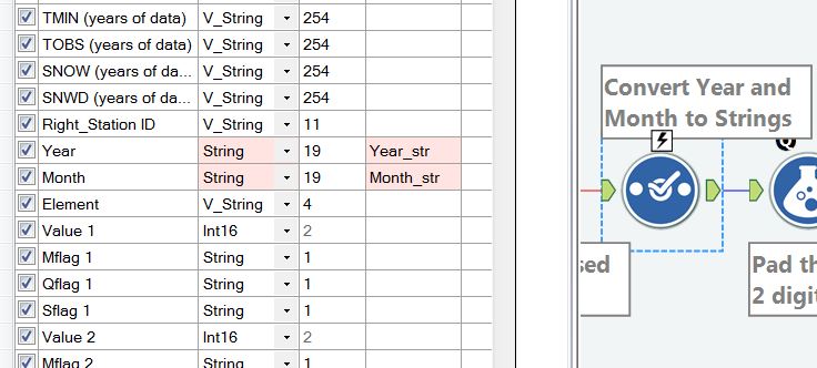
Figure 3 – Converting the year and month fields to strings.
Step 3 – Pad the month_str variable to two digits
Figure 4 shows how to use the padleft function to make all months have two digits in the string. This step might not technically be needed but I used it just to be sure that the upcoming creation of a date did work reliably.

Figure 4 – Pad the month_str variable to two digits so that leading 0’s are in place for the months of Jan – Sept.
Step 4 – Create the day number based on the field name
As mentioned previously, the original designers of this data set did not want to waste space in their files by storing the day that the climate reading was made. Instead, they used an implicit approach whereby the field name (value1, value2, etc) represented the day of the month. Therefore, the “day” number has to be stripped off the field name and padded to two digits to be added to the date string. This operation is shown in Figure 5, in which I combine right and padleft functions to produce the day number.
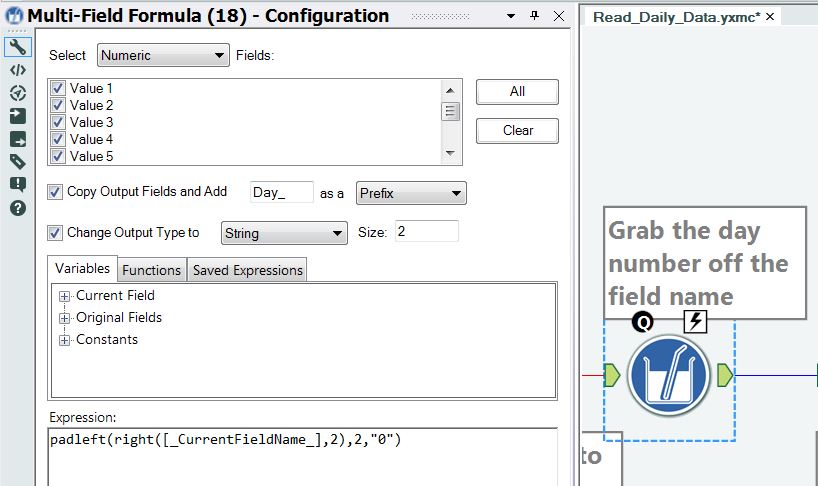
Figure 5 – Create the day number based on the field name.
Step 5 – Create the measurement date for each day in the file, using a multi-field formula
The measurement date is created using some fancy string operations. Notice that the checkbox is selected to change the output to a date data type. All 31 fields have to be selected for this multi-field formula because you have to create up to 31 individual dates for each record in the file.

Figure 6 – Create the measurement date for each day in the file.
Step 6 – Use the select tool to remove some unnecessary fields
It is always a good idea to periodically remove fields that are just taking up space in your workflow. In this step, I do just that as shown in Figure 7. Removing excess fields is a good step to take to optimize your workflow.

Figure 7 – Remove some of the fields that are not needed in the output file
Step 7 – Perform a simultaneous transpose operation on five variables
The following operation is interesting, powerful and can be applied very commonly with a variety of data sets. There are a total of five values that are read on a row-by-row basis. These fields include the date (implicit), measurement value, mflag, qflag and sflag. These variables have to be transformed from row-based structure (they exist in each record) to a column structure. This transformation has to happen by the time the workflow is complete. Figure 8 shows how this looks in the workflow.

Figure 8 – Perform a five-variable, simultaneous transpose operation. This converts row based data to column based data.
Figures 9 and 10 show how the 31 dates and 31 value fields are selected for their transpose operations.
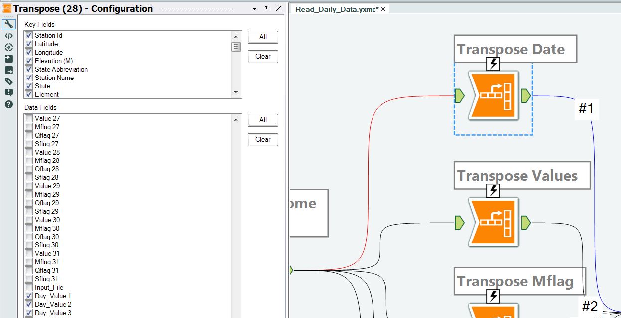
Figure 9 – Transposing the date. All 31 dates have to be selected.

Figure 10 – Transposing the measurement values. All 31 values have to be selected, as do all 31 sflags, mflags, and qflags in upcoming transpose operations.
Step 8 – Rejoin the transposed variables using record position
Since all five variables have 31 fields per row, these variables can be rejoined in one operation as shown in Figure 11. If there were an un-even number of fields across the variables, special care would be needed in rejoining the data because mis-alignments in the records would occur.
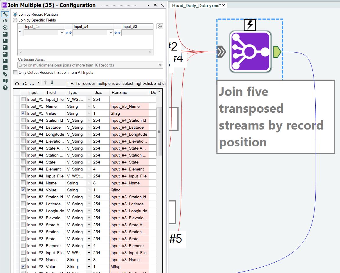
Figure 11 – The five transposed variables are rejoined by record position.
Step 9 – Select the final output fields
This is another simple operation using the select field as shown in Figure 12. It really isn’t doing anything but was inserted during the early development of the workflow and could now be removed.
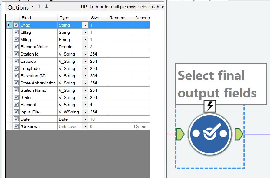
Figure 12 – A now unnecessary select tool.
Step 10 – Remove dates that do not have values
A simple filter is used to remove dates that do not have values, as shown in Figure 13. A check is made to see if the date field is empty.

Figure 13 – Now it is time to start paring down the data in preparation for writing output files. Here I keep only dates that contain values.
Step 11 – Remove measurement dates that have no data records
Another simple filter is used to remove data records that have no values, as shown in Figure 14. A check is made to see if the value field = -9999.
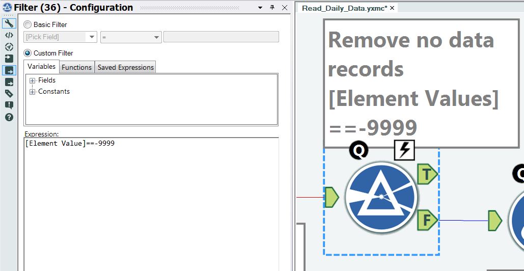
Figure 14 – Removing records that have no values.
Step 12 – Perform data unit conversions
An if-then-else block is used to convert units for each of the five variables we are processing, as shown in Figure 15. The conversions vary depending upon the variables being processed. This is a very efficient way of handling multiple conversions.
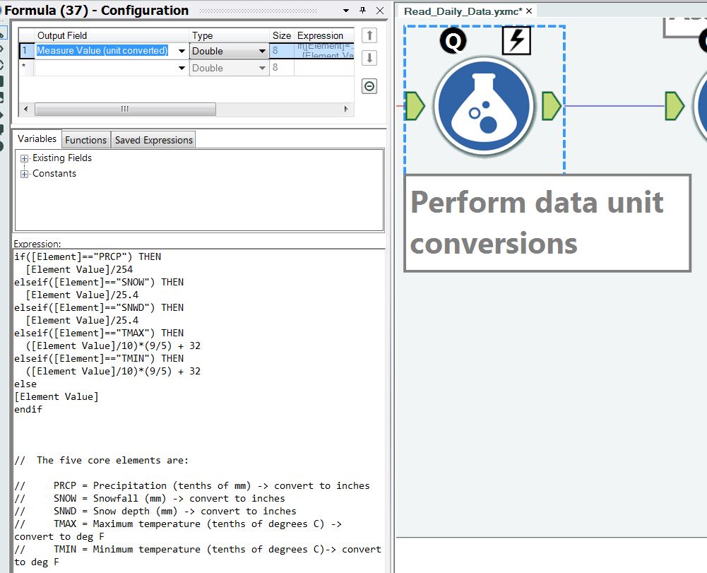
Figure 15 – Perform data unit conversions.
Step 13 – Assign a century bucket
A series of century buckets are created for the data since we have readings going back to the 1700’s, as shown in Figure 16. I would strongly encourage you to read my article about why you would want to use buckets by clicking here.

Figure 16 – Assigning a century name to the data point. This bucket might be used in your Tableau analysis.
Step 14 – Assign a decade bucket
A series of decade buckets are created for the data since we have readings that span so many decades, as shown in Figure 17. I would strongly encourage you to read my article about why you would want to use buckets by clicking here. The actual calculation of the decade is a fairly clever formula and is about as efficient as you can be.

Figure 17 – Assigning a decade name to the data point. This bucket might be used in your Tableau analysis, especially if you are interested in study global warming.
Step 15 – Choose only 5 data types
A filter is used to choose only the five data types mentioned previously (precip, snow, snowd, tmax, tmin), as shown in Figure 18. This filter greatly speeds processing since all other climate measurements are ignored.

Figure 18 – A filter is used to limit the climate data types to the top 5 previously mentioned.
Step 16 – Strip off the file extension
A text to columns operation is used to parse the file name into two pieces, as shown in Figure 19. The reason for this operation is so that I can use the file name as a basis to build the five output files that will be created. The extension of *.dly is not needed for the output file names, so it gets stripped off.

Figure 19 – A text to columns operation is used to split the file name into two pieces: the file name and the file extension.
Step 17 – Strip off the file path
A simple text replace operation is used to strip the file path off of the file name, as shown in Figure 20.
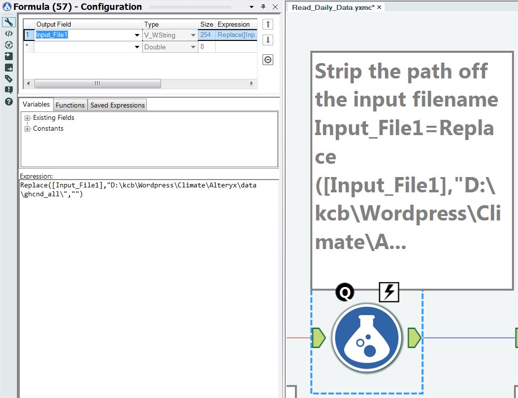
Figure 20 – Strip off the file path from the input file name.
Step 18 – Add the measurement type to the file name
A simple text append operation is used to add the name of the climate element (type of measurement) to the file name, as shown in Figure 21.
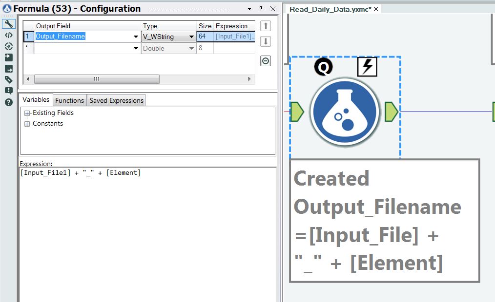
Figure 21 – Add the climate measurement type to input file name.
Step 18 – Reorder the data in preparation for output to the files
A selection tool is used to reorder and pick the final output, as shown in Figure 22.
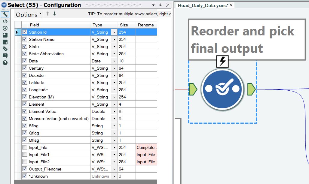
Figure 22 – Reorder the fields for the output file.
Step 19 – Send the output to two different files
The output is shown to two types of files (*.csv and *.tde), as shown in Figures 23 and 24. You will note that the file names are created automatically by Alteryx, as shown in the lower left corner of Figures 23 and 24. This is a very powerful feature of Alteryx. The output file name is created using the field we assembled called “output_filename”. The extensions of *.csv or *.tde are automatically added by Alteryx. The *.tde file is a Tableau data extract and these files can directly be loaded in Tableau.

Figure 23 – The output file name is chosen for the *.csv file by using the field called “Output_Filename”.
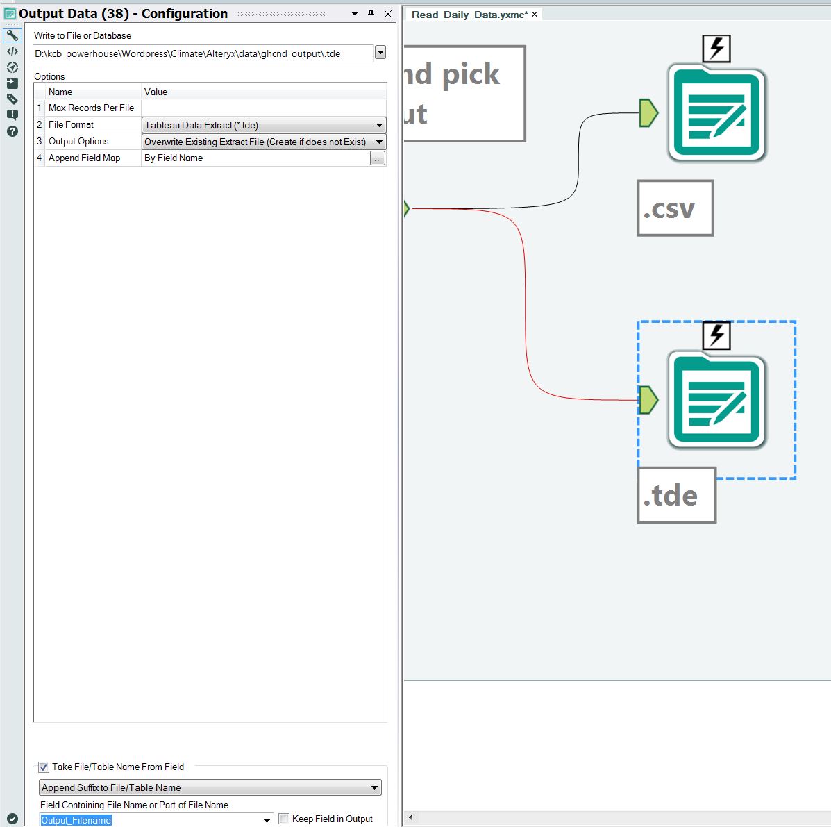
Figure 24 – The output file name is chosen for the *.tde file by using the field called “Output_Filename”.
Step 20 – Viewing the output.
Figure 25 shows a partial list of the files created by processing the top 200 monitoring stations, and Figure 26 shows the actual content of one of the *.csv files.

Figure 25 – The partial list of files created by the workflow when a list of 200 top monitoring stations is sent to the macro.
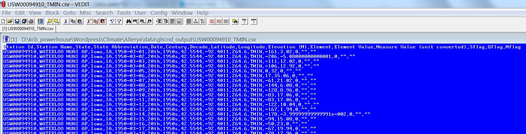
Figure 26 – Example content of a csv file.
Upcoming in Part 5
The project continues by using Alteryx to statistically process the temperature records from the top 200 monitoring stations, as well as taking an in-depth look at the precipitation and maximum temperature trends in Texas, USA. Tableau is used to visualize these results.
Click here to continue to Part 5.
If you like this article and would like to see more of what I write, please subscribe to my blog by taking 5 seconds to enter your email address below. It is free and it motivates me to continue writing, so thanks!


Thanks Ken- I’ve been enjoying this series of posts. As a long-time Tableau user, I’m also very interested in identifying tools that complement it well by letting an end-user perform the upstream data preparation in an easy way. There are other ETL tools out there, but Alteryx seems to have the tightest integration – I only wish it could take TDEs as in input (unless I am reading their documentation wrong, it looks like it can only output TDE).
I’m hopeful that the small steps Tableau has taken in 9.0 enhancements to the data connection screen (excel validation and pivot columns) are an indication that they will continue to build out a more robust data-prep solutions. Data blending has only ever been ok at best. I wish Tableau would just buy Alteryx and roll in the data prep stuff to the core Tableau Desktop product. The geospatial analysis that Alteryx does (which I understand is the company’s historic core competency) is neat, but feels like a feature contributing to Alteryx’s high price tag that won’t get used by most people.
Hi Jason,
Thanks for writing and I’m glad that you are finding value in this series! The work required to conduct and write this series was on the order of 100 hours, so thanks for letting me know that someone has been reading it! When I chose to write this, I did so because there was no example like this available for me to follow or work through when I was learning Alteryx last year.
The work that Tableau completed as part of creating version 9.0 is going to be very helpful for users. I have been using Tableau on a daily basis since version 3.6, so I have seen the progression of the software first-hand. My personal adventures in data blending in Tableau have been replaced by using Alteryx. I no longer think of Alteryx as a “nice to have” software package. It is now equally, if not even more valuable to me, than Tableau. I am now in my ninth month of usage of Alteryx and I’m inventing some amazing techniques that have revolutionized the way I attack my job. I think it is only a matter of time before Alteryx fully explodes onto the BI scene, much like Tableau has done.
As far as the companies merging, I offered some thoughts on this in the last paragraph of this article just before the Final Thoughts section: https://datablends.us/2014/11/17/how-and-why-alteryx-and-tableau-allow-me-to-innovate-part-2/
Ken
Pingback: How To Build An #Alteryx Workflow to Visualize Data in #Tableau, Part 3 | 3danim8's Blog
Pingback: How To Build An #Alteryx Workflow to Visualize Data in #Tableau, Part 5 | 3danim8's Blog
Pingback: How to Use and Better Understand Alteryx Batch Macros | 3danim8's Blog
Pingback: 3danim8's Blog - How To Build An #Alteryx Workflow to Visualize Data in #Tableau, Part 5
Pingback: 3danim8's Blog - Do You Live In An Area Impacted By Global Warming?