Introduction
Over the past few months, I have been using Tableau and Alteryx to investigate world-wide climate data. This work has caused me to think about climate and local weather variability and our ability to predict what is going to happen in the future.
I am not a climatologist, but I do have a lot of training and experience in simulating natural environmental systems. Last week the headlines indicated that a winter storm of previously unseen proportions was going to slam New York and Boston and other northeastern cities. As shown in Figure 1, New York was spared but Boston got slammed.
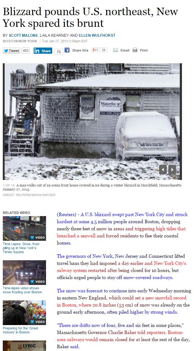
Figure 1 – The blizzard of 2015. How did it miss New York, I wonder?
Since I do not do climate modeling, I wondered how the predictions of a massive blizzard for New York City could be so inaccurate. How could the weather forecasters and/or the models they use simply be that wrong?
To answer the question, I wanted to understand a little bit more of the vertical stratification of wind and temperatures on earth. I want to understand the vertical variability of wind and temperature across North America, and in particular the northeast region.
Are the models inaccurate simply because the wind directions are changing the higher you go? I wondered if I could visualize the driving forces that create a situation that leads to blizzard conditions having 3+ feet of snow coupled with 70+ mile per hour winds.
The Variation of Wind and Temperature With Respect to Elevation
This type of work is new territory for me, other than when I watch the elevation and temperature data on a high-altitude jet flight. I have a favorite tool that I have been using to visualize real-time climate data. I am not sure how much of temperature data that is displayed is based on real data and how much of it is based purely on simulated data (climate model output). In either case, I love this tool. It is one of the most visually stunning interactive websites that I know about.
Using this tool, I captured a series of pictures of temperatures and wind patterns from eight elevations above mean sea level. You can do this by clicking on the word Earth in the lower left corner of the web page and it will give you options to view other types of data you might be interested in.
One interesting thing I discovered was that the elevations are reported in units of pressure (hPa), rather than units of elevation. This lead me to discover a new concept I was unaware of called the geopotential height, as shown in Figure 2.
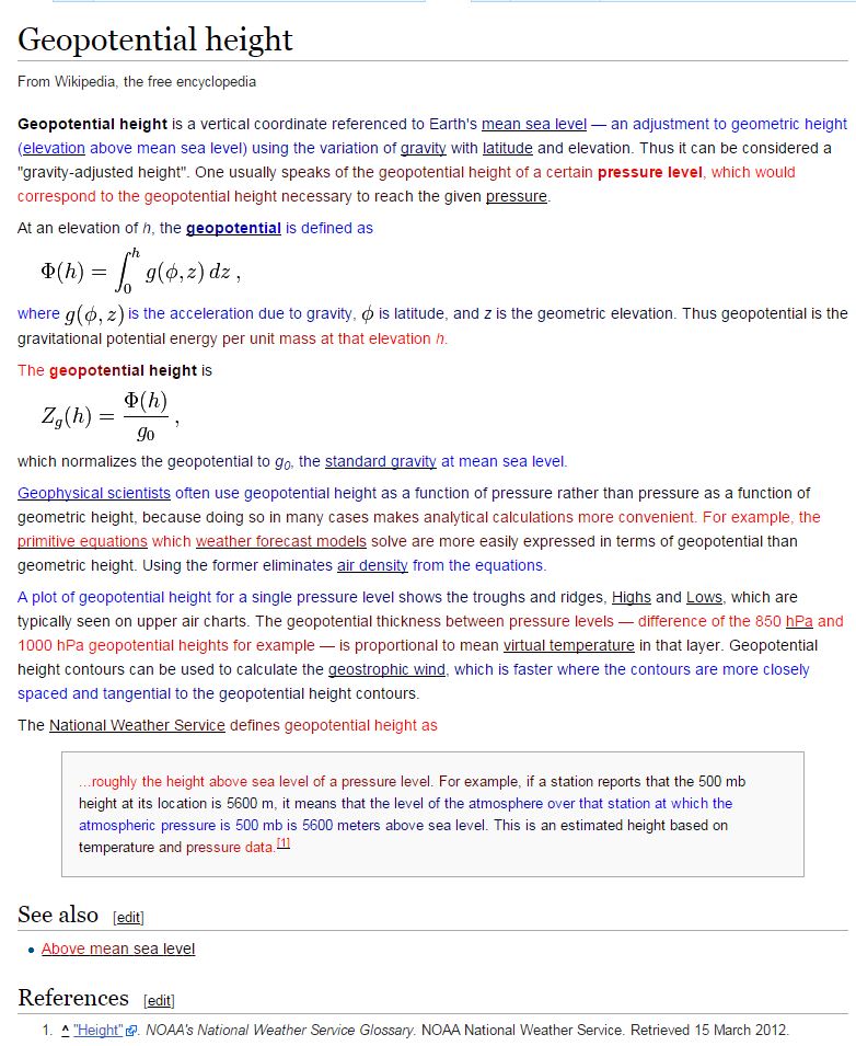
Figure 2 – The definition and the equation of geopotential height.
Now that I understand why elevation is reported in units of pressure, I found a calculator that would convert the pressures to elevations for me. Figure 3 shows the calculator I used for this work.
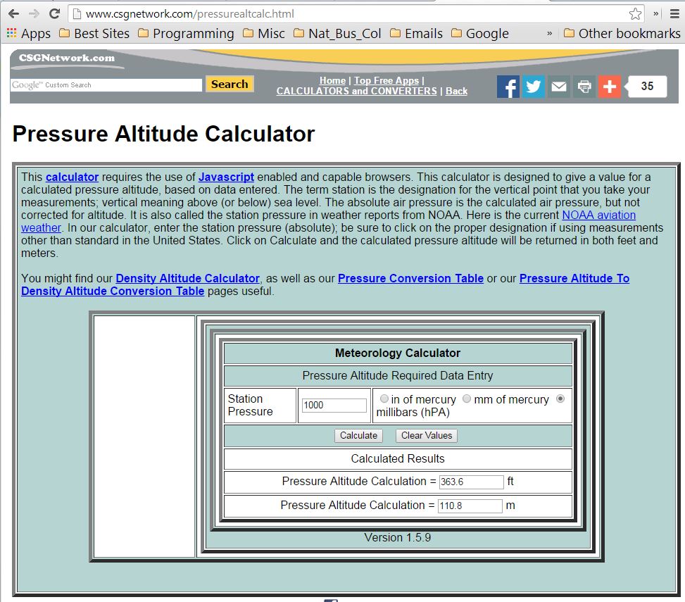
Figure 3 – Pressure to elevation calculator.
After completing the conversions, I used Tableau to produce Figure 4. In Figure 4, a series of Figures (5 through 12) are noted along the horizontal axis. These figures show the temperature distributions and wind directions that currently exist as we go from the surface (sea level) up to an elevation of 10 hPa (85,000 feet high). I included a few reference points to help me comprehend the elevations for each figure.
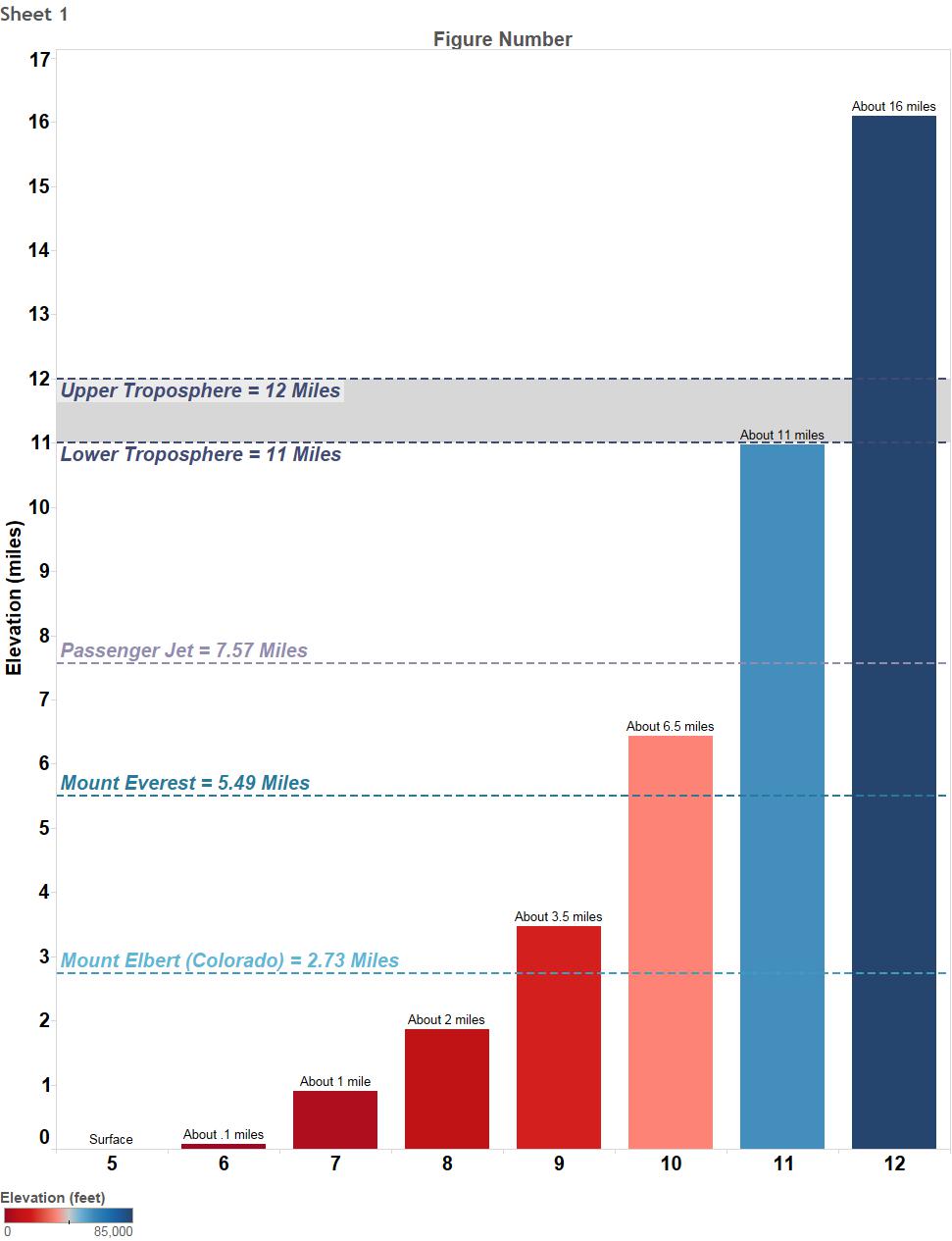
Figure 4 – Elevations shown in Figures 5 through 12.
Figures 5 – 12 are visualizations that show the current weather conditions (Jan 30, 2015) that exist over the northern hemisphere, with North America centrally located. By viewing Figures 5-12, you can see the variability in temperature and wind patterns as you move upward from the earth surface.
The color scale is used to represent temperature, with red being the hottest and purple the coldest. When you are in the interactive setting and you hover on a color in the color scale, you see the actual temperature. It is very interesting to see how quickly the temperature drops as you go higher. Finally, in Figure 12 at 85,000 feet (above the troposphere), you see that it is warmer than in Figure 11 at 57,950 feet.
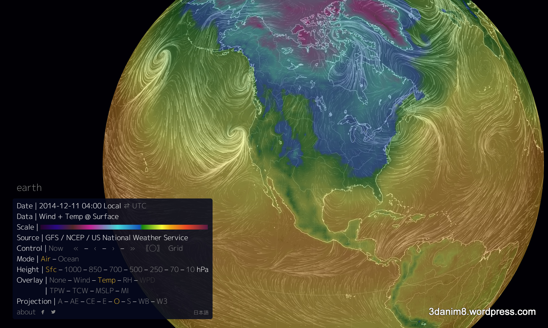
Figure 5 – Temperature and wind patterns at mean sea level (1013.25 hPa).

Figure 6 – Temperature and wind patterns at Elevation at 365 feet (1000 hPa).

Figure 7 – Temperature and wind patterns at Elevation at 4800 feet (850 hPa).
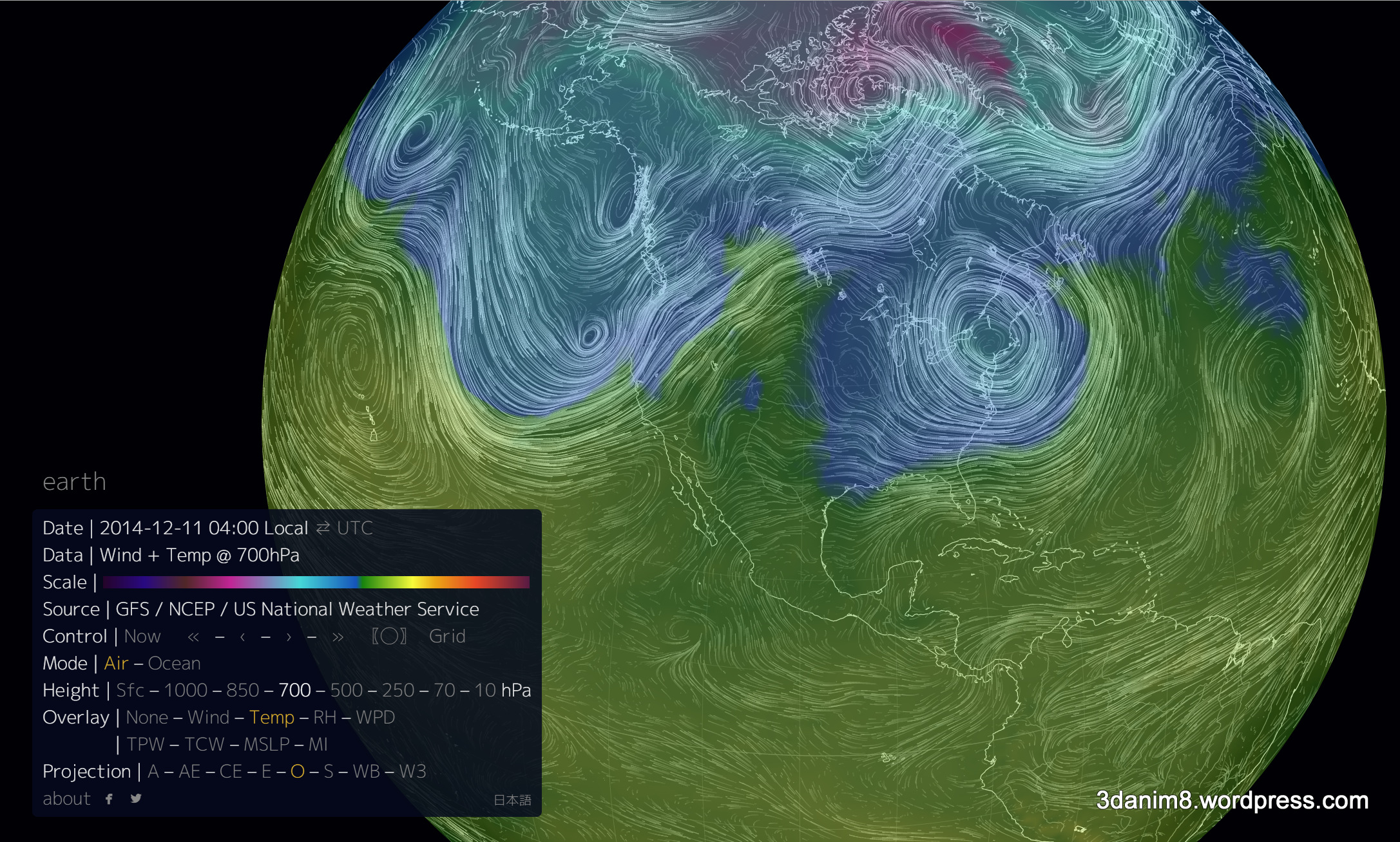
Figure 8 – Temperature and wind patterns at Elevation at 9880 feet (700 hPa).
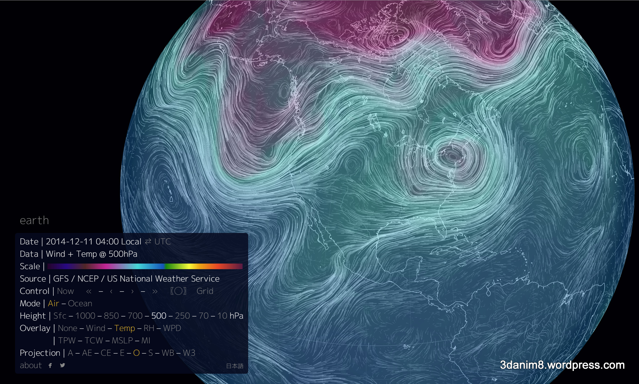
Figure 9 – Temperature and wind patterns at Elevation at 18821 feet (500 hPa).

Figure 10 – Temperature and wind patterns at Elevation at 34000 feet (250 hPa).
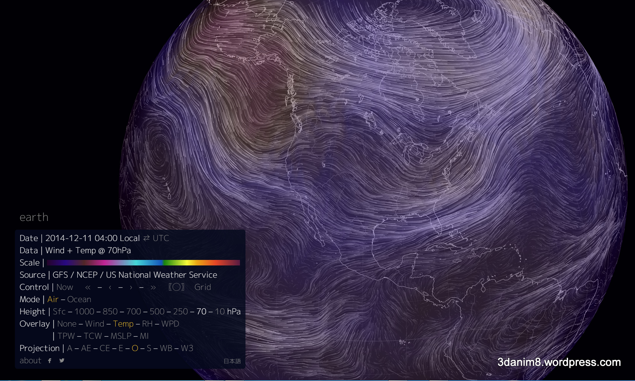
Figure 11 – Temperature and wind patterns at Elevation at 57950 feet (70 hPa).
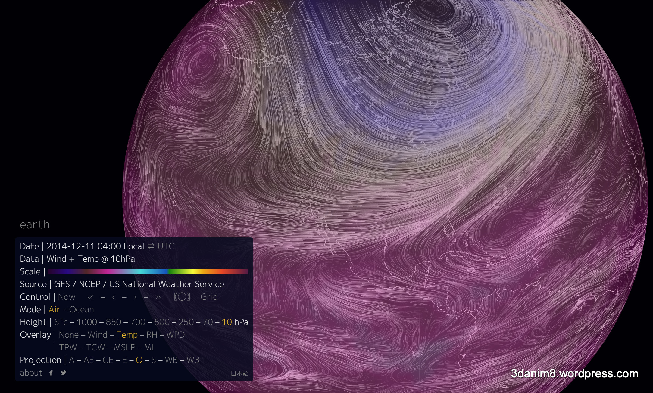
Figure 12 – Temperature and wind patterns at Elevation at 85000 feet (10 hPa).
These figures clearly show how much variability exists in temperatures and wind patterns at various elevations. This high-degree of variability is one reason that long-term climate modeling and short-term weather forecasting is so difficult. It is why forecasting a blizzard for a city can be a hit-or-miss proposition.
Final Thoughts
If you want to get serious about this type of work, go to this website. This has more information on atmospheric temperatures with respect to elevation than anything else I’ve seen. The website is maintained as part of the National Weather Service’s Climate Prediction Center.
If you like this article and would like to see more of what I write, please subscribe to my blog by taking 5 seconds to enter your email address below. It is free and it motivates me to continue writing, so thanks!


Slightly off topic but here are some other cool animated wind-centric visualizations
http://earth.nullschool.net/#current/wind/surface/level/orthographic=-10.00,51.53,367
http://hint.fm/wind/
Hi Mark,
Thanks for writing and for the information. I’ll definitely be checking this out!
Ken