Introduction
This is part 5 of a blog post series on combining Alteryx and Tableau to perform a real-world example of an ETL-based analytics project. If you want to read previous parts to this series, click on these links: part 1, part 2, part 3, or part 4. In this article, I use Tableau to visualize the climate data that was processed in Alteryx.
Yesterday I saw another climate headline that described how 2014 was the hottest year ever recorded. That article also included a nice animation that is worth viewing. In this animation, monthly records for each year are overlaid on top of each other as the animation marches through time. The dotted lines represent the annual averages, which move around over time. When you watch this animation, you can see how the average temperatures are moving upward. This animation continues to maintain the maximum temperature recorded as time progresses. In Tableau, I could not think of a way to replicate this feature, but it sure would be nice to have it! Also, there is no information in this article on the spatial coverage this data represents (US only or it it world-wide?).
Using Tableau To View The Data
Now that we have data and a method to process it, I decided to do a couple of different things. First, I made a map of the worldwide climate monitoring network that is included in this data. Figure 1 shows the 92,500+stations that exist throughout the world.
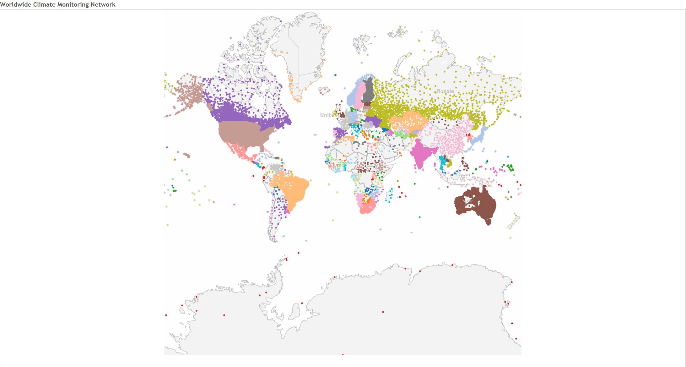
Figure 1 – The worldwide climate monitoring network.
From this set, I chose to investigate the top-200 United States monitoring stations. The top-200 were chosen based on the amount of data recorded over time at these stations. Figure 2 shows the distribution of these stations. It took Alteryx about 100 minutes to process the climate data from these 200 stations, which created about 1,000 *.csv files and 1,000 *.tde files. Remember, there are five types of climate data in the data processing workflow.

Figure 2 – The top-200 U.S. climate monitoring stations based on data quantity.
I had some additional fun by using Alteryx to processing ensemble statistics from the top-200 monitoring stations. Developing these workflows reinforced to me how powerful Alteryx can be in processing large quantities of data like this. I was able to calculate ensemble statistics for precipitation and max temperatures on a daily basis or lumped by year or decade very easily. Although I’m tempted to discuss this topic further, I’ll save it for later when I have more time time to explain the powerful summarize tool in Alteryx. The summarize tool is worth the cost of Alteryx, all by itself.
Zooming Into Texas
Once I processed this data, I zoomed into Texas because there were quite a few monitoring stations in the top-200 list. I started to work with the Texas-based data and then decided to take a serious look into the Texas data. At that time, I decided to deviate from my nationwide perspective to focus on Texas.
When you begin studying Texas, you realize right away that there is a lot of climate data originating from that massive state. Figure 3 shows the distribution of the 3,800+ monitoring stations that either exist or have existed in Texas!
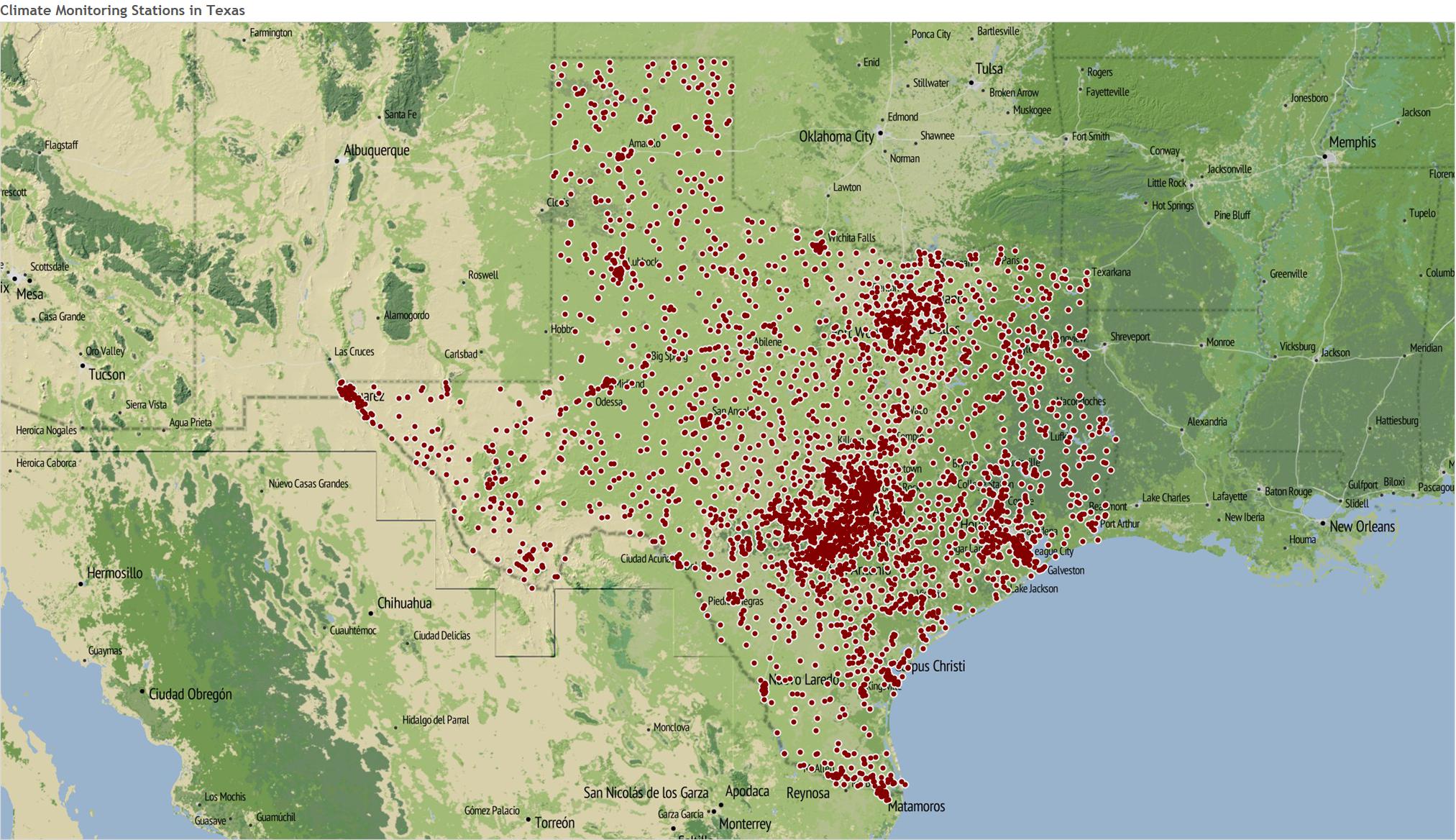
Figure 3 – All the climate monitoring stations in Texas (wow!).
Rather than processes all of those stations, I began by examining the data from this subset of monitoring stations. I wanted to find stations that have long-term precipitation records. I started by filtering the data to include the stations that had at least a 50-year record of precipitation. Figure 4 shows the distributions of these stations.

Figure 4 – Texas monitoring stations that have at least 50-year records of temperature.
Since there are so many stations, I decided to limit my list of stations further by picking the top-100 stations having the longest term records for precipitation. These stations are shown in Figure 5.
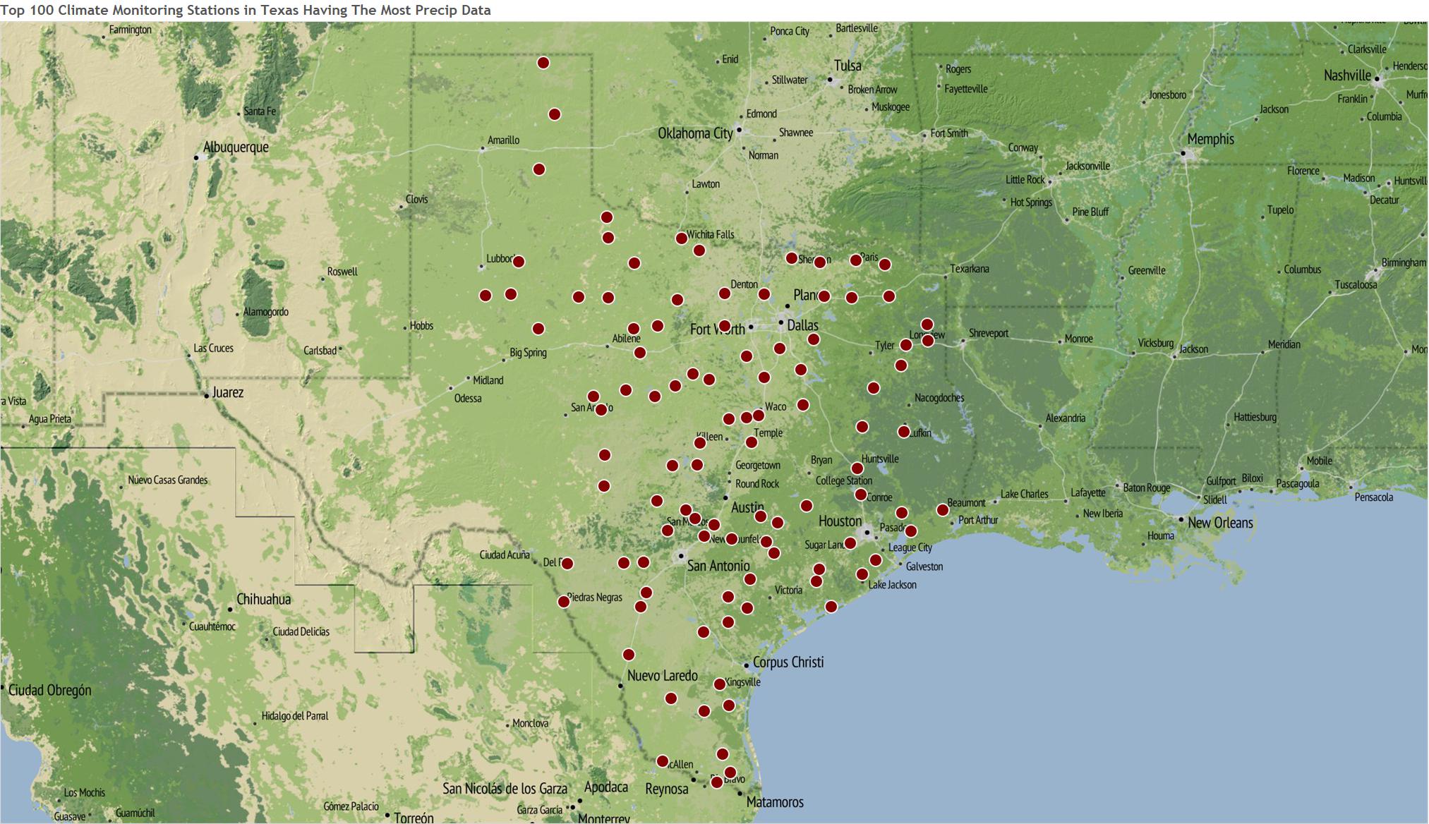
Figure 5 – The top-100 Texas monitoring station for precipitation data.
Precipitation Across Texas
To examine how precipitation has changed over time, I chose five monitoring locations from the Top-100 stations. These represent the western, northern, central, southern, and eastern parts of Texas. These stations are shown in Figure 6.
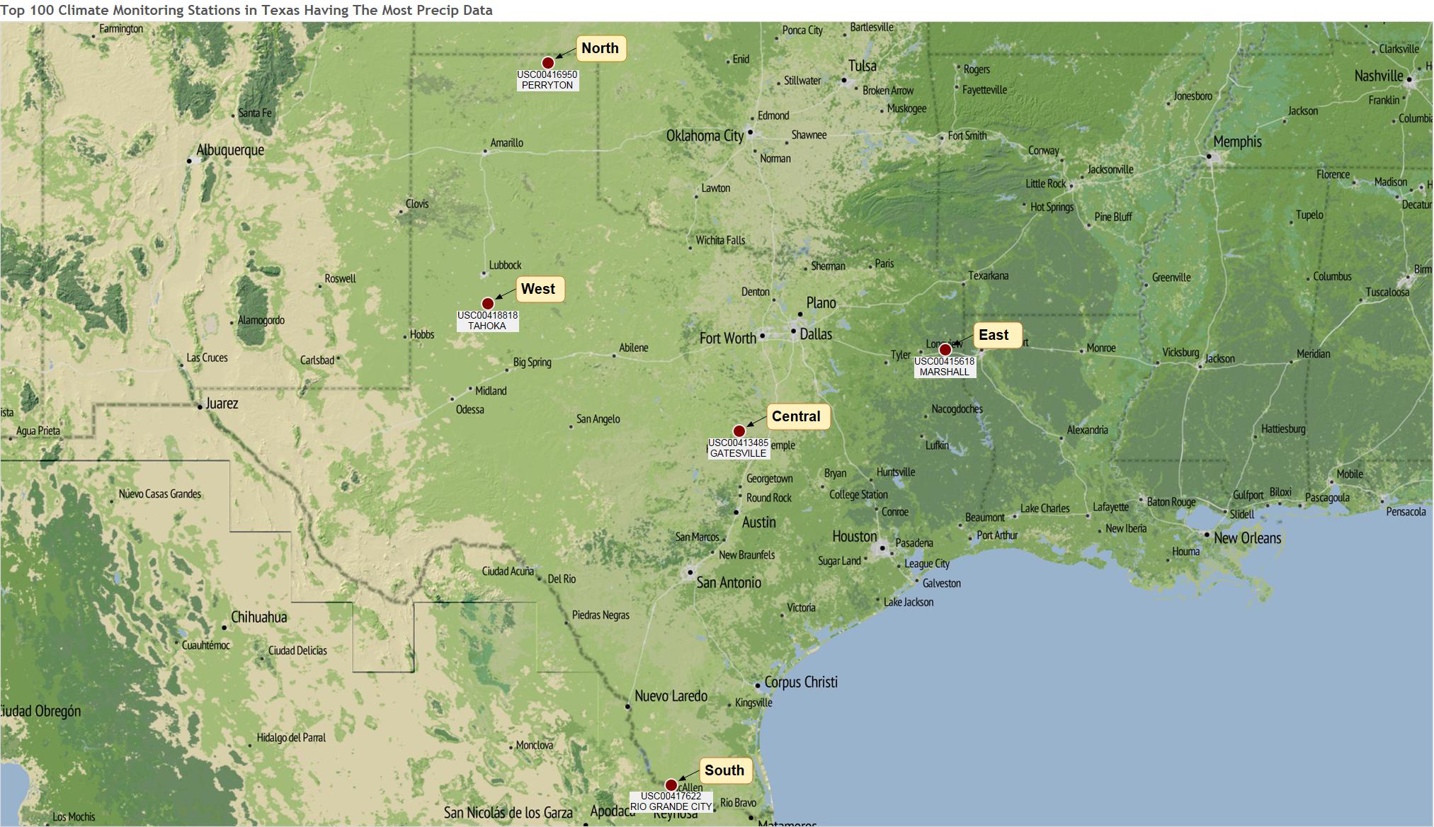
Figure 6 – The five monitoring stations used to evaluation precipitation over time.
In addition to the top-100 precipitation stations, I grabbed another 500+ stations that had the most temperature data. Overall, I used Alteryx to process about 600 Texas monitoring stations to give me a bit of data to work with. It took about 2.5 hours for Alteryx to create about three thousand *.csv and *.tde files.
Now with the *.tde files available, I used Tableau to generate time series plots of precipitation. I created annual totals, grouped using the decade buckets created in the original Alteryx workflow. I also looked at daily records to find some amazing storms that have hit Texas. The daily rainfall amounts in certain areas were huge!
Now getting back to the story, I wanted to find out how precipitation patterns may be changing over time. I have heard stories about the drought in West Texas that has caused towns to de-populate. In particular, the town of Plainview has experienced droughts in 2011 and 2012 which caused major problems for the residents of that town. Plainview is located less than 80 miles north of the the monitoring location shown in the label “west” (Tahoka, TX) in Figure 6. The TV show 60-minutes recorded a segment on how climate change has caused this town such hardship.
Figure 7 contains the long-term precipitation record from Tahoka, TX. The annual precipitation in 2011 and 2012 was about half of the normal amount expected, which severely impacted the area. Luckily the 2013 and 2014 totals are more representative of long-term averages, which fluctuate between 16 and 21 inches per year. The decade average lines show natural variability over time and this record does not indicate that west Texas is experiencing a sustained, long-term drought.

Figure 7 – Precipitation in the western part of Texas (averages 21 inches/yr).
In the northern part of Texas as shown in Figure 8, the 2010 decade shows more of a suppressed precipitation pattern than at the western location. The northern site receives about 2 inches more rain per year on the long-term average than the western site. Comparing the 2000’s to the 2010’s shows that the northern site has experienced a precipitation loss of 5 inches per year.

Figure 8 – Precipitation in the northern part of Texas (averages 22 inches/yr) .
Precipitation in the central part of Texas is shown in Figure 9. The past three decades has shown a downward trend in annual average precipitation, although the region is within its normal range of fluctuation. In this location, the long-term annual precipitation is about 34 inches per year.

Figure 9 – Precipitation in the central part of Texas (averages 34 inches/yr).
Precipitation in the southern part of Texas is shown in Figure 10. The 2010’s decade has been drier than average, with about 5 inches less precipitation occurring on average.

Figure 10 – Precipitation in the southern part of Texas (averages 23 inches/yr).
Precipitation in the eastern part of Texas is shown in Figure 11. The past three decades has shown a downward trend in annual average precipitation, although the region is within its normal range of fluctuation.

Figure 11 – Precipitation in the eastern part of Texas (averages 50 inches/yr).
Based on this analysis, it looks like Texas has been experienced less precipitation over the past 1 to 3 decades. The next part of the analysis will examine maximum temperatures in Texas.
Average Annual Maximum Temperatures Across Texas
I processed a long-term maximum temperature record for the 15 Texas monitoring stations that were shown in Figure 2 (the top-200 US stations). The 100+ year record shows a cooling period from the 1900’s to the 1980’s followed by an increasing trend in average annual maximum temperature, as shown in Figure 12. However, since the number of monitoring stations was changing from 1900 to 1949, I decided to focus on the last 60+ years of information.

Figure 12 – The annual average maximum temperature recorded at the 15 Texas monitoring stations shown in Figure 2. Note that not all 15 stations were active across the entire time frame.
Average Annual Maximum Temperatures Across Texas
Figure 13 shows the average annual maximum temperature as recorded in the 15 Texas monitoring stations Clearly this figure shows that Texas is experiencing an increasing maximum temperature since the early 1980’s. With only 15 stations determining this trend, I was interested to see what the trend looked like from a much larger number of monitoring stations.

Figure 13 – The annual average maximum temperature recorded at the 15 Texas monitoring stations shown in Figure 2.
To answer the question, I had Alteryx summarize the data from all stations that had 60+ years of maximum temperature data. In Figure 14, data from between 250 and 320 monitoring stations is used to calculate the annual average maximum temperature. The trend shown in Figure 13 has been repeated in Figure 14, thereby indicating that Texas is indeed experiencing higher annual maximum temperatures. The average annual maximum temperature has risen about 1.5 degrees F over the past 35 years.

Figure 14 – The annual average maximum temperature recorded at 250 to 320 of the Texas monitoring stations shown in Figure 4.
Average Monthly Maximum Temperatures Across Texas
I wanted to analyze the maximum temperature data in another way. Figures 15 through 17 show the average monthly maximum temperature for between 200 and 330 monitoring stations. Each chart represents a 10-year period, with the data beginning in 1963. As shown, in Figure 17, the highest monthly maximum temperatures have occurred very recently.

Figure 15 – Average monthly maximum temperature in Texas, starting in 1963 and then showing 10 years later in 1973. The other lines shown are the intermediate years between 1963 and 1973.

Figure 16 – Average monthly maximum temperature in Texas, starting in 1983 and then showing 10 years later in 1993. The other lines shown are the intermediate years between 1963 and 1993.

Figure 17 – Average monthly maximum temperature in Texas, starting in 2003 and then showing 10 years later in 2013. The other lines shown are the intermediate years between 1963 and 2013.
Sorry, I’m Out of Time
I wanted to continue this analysis and summarize what I have learned. Here is the very brief summary:
- Texas is seeing less rainfall over the past 1 to 3 decades;
- Texas is getting hotter.
Those two findings are unequivocal.
I also wanted to show you have awesome Alteryx is at summarizing a lot of data. There were a couple of more articles I had planned for this series. Unfortunately, however, I am out of time.
In a few minutes, another blog post will be published that will explain why that is the case. Maybe in the future I’ll have a chance to continue this work. For now, I’ll have to close this series. Thanks for reading.
Update 1.5 Years Later, on July 20, 2016
Today it was reported that Jan-June, 2016, was the hottest six-month period EVER recorded (Figure 18). Click here to read the article.

Figure 18 – The first 6 months of 2016 were the hottest ever recorded.
Update on 10/13/16
Ramon Martinez is a Tableau Master. He is totally professional, in every aspect of the word. He is also artistic, scientific and one of the best Tableau dashboard builders in the world. There is no doubt about that, and if you are like me coming from a scientific background, Ramon is the man to follow because he has set the bar so high that very few people will ever be able to touch it.
Click here to view his recent global temperature dashboard (Figure 19). This is an example of the best of the best, when it comes to visualizing time series data and using Tableau at its finest. Congrats to Ramon for creating this masterpiece.
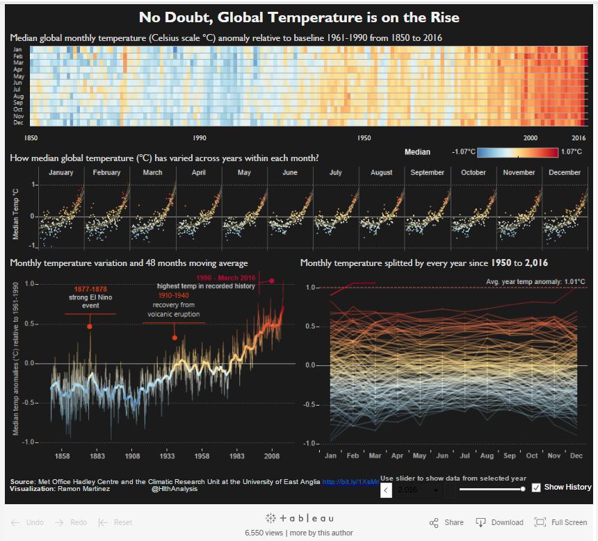
Figure 19 – Another masterpiece from one of my Tableau idols, Ramon Martinez.


Pingback: 3danim8's Blog - Do You Live In An Area Impacted By Global Warming?