Introduction
The techniques shown in this article are a little sneaky because I use a couple of sublime mathematical operators and I use Alteryx to crush some raw data. I’ll also say that this article is not finished. I will be revisiting it in the future to add more quantitative techniques once I develop the methods I have envisioned.
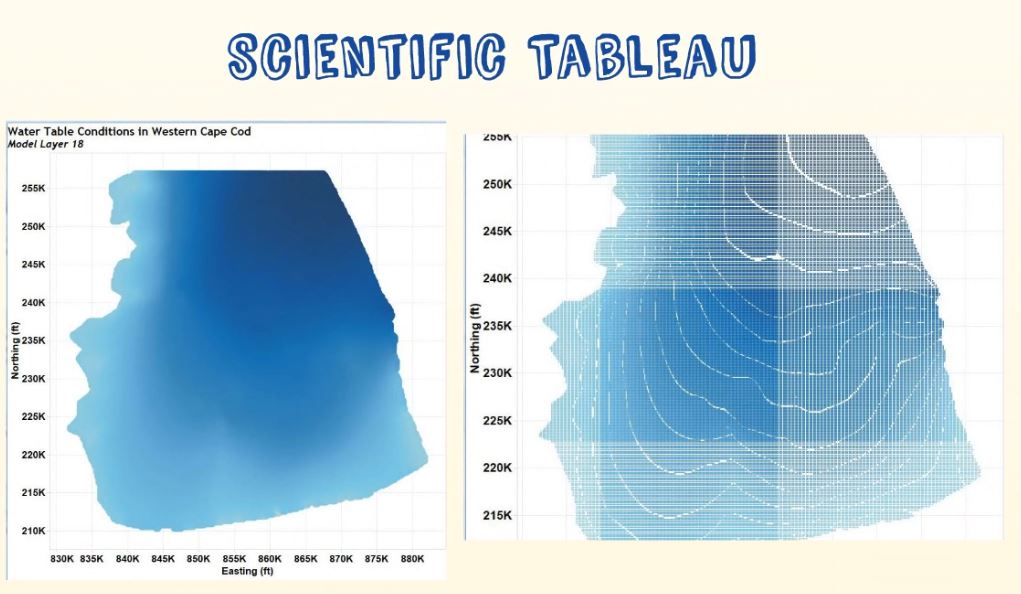
Right now, I show how you can draw simulated topographic contour lines in Tableau if you have a regular, hi-resolution structured grid of topographic data. I also show how you can render raw topo data.
Background
As is the case with many of my articles, this one builds upon something I previously published. In that article, I describe drawing a shaded topographic map in Tableau.
The topographic lines drawn here are not simply-connected polylines, which is what you would expect topo lines to be. Upon close inspection, the lines are defined by a series of nodal points that represent the centroids of a mathematically optimized topographic surface. This is why I refer to this method as being one in which topo lines are simulated. However, because colors are used to define the elevations of the topo lines, the generated maps look like topo maps!
Depending upon how much you zoom into the map, the nodal discretization may become visible and the image will look more like a collection of points rather than lines. For this reason, this method is only useful when you have really high-resolution data. In some cases, it will be good enough to use in your projects.
In the video shown below, I show how a parameter can be used to select the topographic contour interval you desire. I describe how this works in the video. I use a combination of a round function for elevation combined with a mod operator to generate n-topographic lines, but then I use a filter to show only one of the n-lines. This allows you to draw whatever contour interval you want, including being able to draw them at whatever starting point you want. All of this verbiage is described in the video.
The resulting topographic map with a 10-foot contour interval is shown in Figure 1.

Figure 1 – Topographic map with 10-foot topographic lines.
Going Bad to the Bone
Rendering about 1.2 or 1.4 million points is child’s play for Tableau. I thought I’d drop the hammer on Tableau to see how she would respond. I wondered how much she would buckle by having to filter over 36 Million values! Wow, I can’t believe I’m going to try to deliver this much pain to one of my best friends.
In this example, I’m sending the entire mathematically optimized grid for Southern Zambia to Tableau in an attempt to draw another topo map with 20-meter contours. I wouldn’t dare do this with Power BI, but then again, there are a lot of things I can’t do in Power BI. You can call this a power-user test, and I have no idea how this is going to end.
Figures 2 and 3 shows what the topographic surface looks like over southern Zambia as rendered by Tableau and by Dudley with his tp2 drawing program for the mathematically optimized form of the data. I have to say that Dudley’s coloring is better for this type of data than what I used in Tableau. You can click the images to see full-resolution versions.
Drawing Raw Topo Data
In the final video of this article, I show how I used Alteryx to process the raw topo data on a 20 m contour interval for all of southern Zambia. This example is used to demonstrate how the 90 m^2 data looks in its raw format. Raw topo data isn’t created in a clean single-polyline format!
Finishing This Work Will Be a Future Endeavor
One day I’m going to return to this article with an approach for properly drawing 2d simply connected polylines for the contour lines. I have had this article sitting around for too long in my draft box.
Now I’m just going to publish it with the hope that it spawns some curiosity and helps someone solve a problem they are having in Tableau. Sometimes research just needs to be published, even if it isn’t finished or polished to the degree I want it to be.


Fantastic stuff, Ken! FYI the reason why the bottom maps look grey is probably due to mark borders being on by default, when I’m dealing with lots of small marks I’ll always set them to None.
Hi Jonathan,
Thanks for your response – I’m honored. I must be honest about my feelings towards this article. I was embarrassed to publish it last night! I’m not happy with it, but sometimes writing something is better than nothing.
The reason I feel this way is that I know it isn’t finished. It isn’t polished. This article has been sitting in my draft box for months and it has been bugging me, so I decided to get it out there.
I’ve got to find some time to make a more formal contouring program for Tableau. I’ve been toying with the theories on how to do it for the past few years, but I keep getting sidetracked with other interests, like working with the weather data.
Thanks,
Ken
