
Introduction
This story begins last Christmas (2015), which is when I received a nice gift from my wife. She gave me a solar-powered Acurite weather station for our house (Figure 1).
She knows that I am very interested in data and weather, so this seemed to me to be the perfect gift.

Figure 1 – An example of the weather station used to collect the data in this article. (click any picture for a full-size version).
If you have read this blog before, you probably already know my motto:
I treat all data as guilty until it is proven innocent
This article is a perfect example of why I am part lawyer, part data scientist, part data dork, and why I believe in that motto. What you will see might surprise you, but then again, maybe it won’t if you are naturally skeptical.
Background
In the beginning of my career, I spent a couple of decades deploying all types of electronic data collection systems for the environmental studies I was involved in. I installed pressure transducers to record water level responses, weather stations to collect precipitation, temperature, humidity, and atmospheric pressure, and many other types of systems.
In other words, I’ve been around the block a time or two when it comes to recording, analyzing and using electronically-collected data. I know a lot about what can go right, and more importantly, what can go wrong. One example of what can go wrong is having lightening strike your recording equipment. I can tell you that pressure transducers and recording systems do not like lightening strikes!
So when my wife gave me the weather station gift back in December, I was pretty happy to install the system and start recording the data. I had a feeling that a blog post was being born on the day that I installed the unit. I had visions of Tableau visualizations and all kinds of insights related to my weather data.
The weather station installation was a simple thing to do. There were no calibrations necessary – all I had to do was level the unit and screw it down onto the railing of my deck, as shown in Figure 2. Afterwards, I had to plug in the inside unit and my weather data career was off and running. Wireless connections exist between the solar-powered weather station and the interior unit.

Figure 2 – Easy installation of outdoor weather station unit.
Once data collection began, all I had to do was connect my laptop to the inside unit to download the data. The data is recorded and stored every 12 minutes, which means that there are 5 readings per hour. There are 15 pieces of data being collected, as shown in Figure 3.
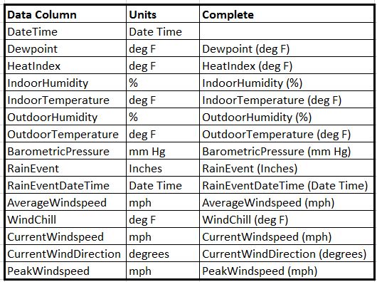
Figure 3 – The data collected by the weather station.
An example of the data collected at my house is shown in Figure 4. Initially, I did not understand that the data logger only held 2 weeks of data. Therefore, by the time I did my first data download, the data remaining in the logger started on Feb 15, 2016.
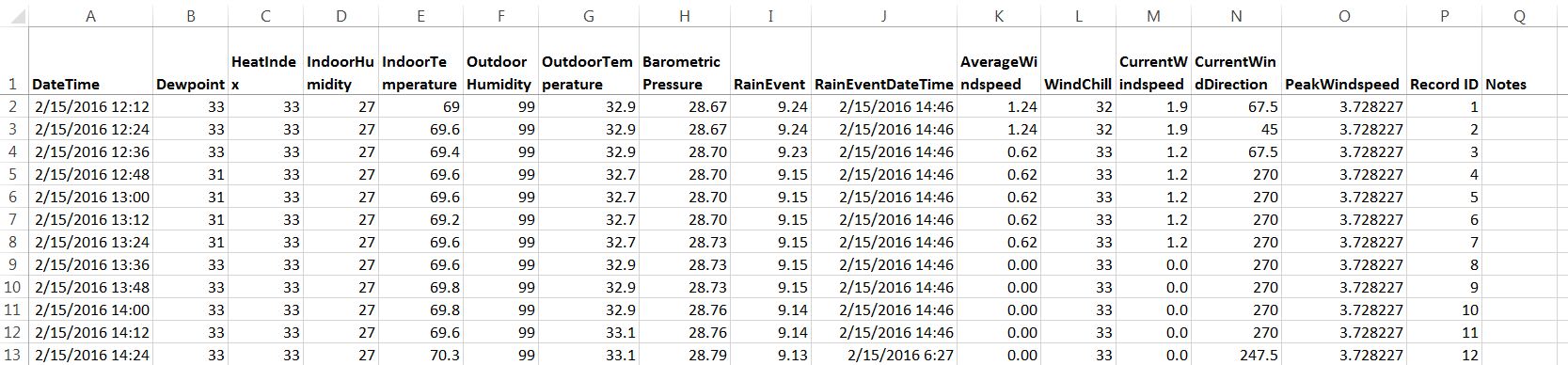
Figure 4 – The data collected at my house, starting on Feb 15, 2016.
Using Tableau to Visualize the Weather Data
As with most projects like this, I loaded the data into Tableau to visualize the time series history of the data being collected. I thought that after a few data downloads, everything was looking good. I saw the outdoor temperatures starting to climb as springtime approached, as shown in Figure 5.

Figure 5 – Outdoor temperature and wind speed.
I got all geeky and set-up parameter driven scatter plots so I could investigate any variable against any other variable, as shown in Figure 6. This link contains the Tableau packaged workbook for this data. You have to download the file and rename it from *.zip to *.twbx. I had to do this to fool the wordpress content management system. On the page called scatter plots, you will find the parameter driven scatter plot approach.
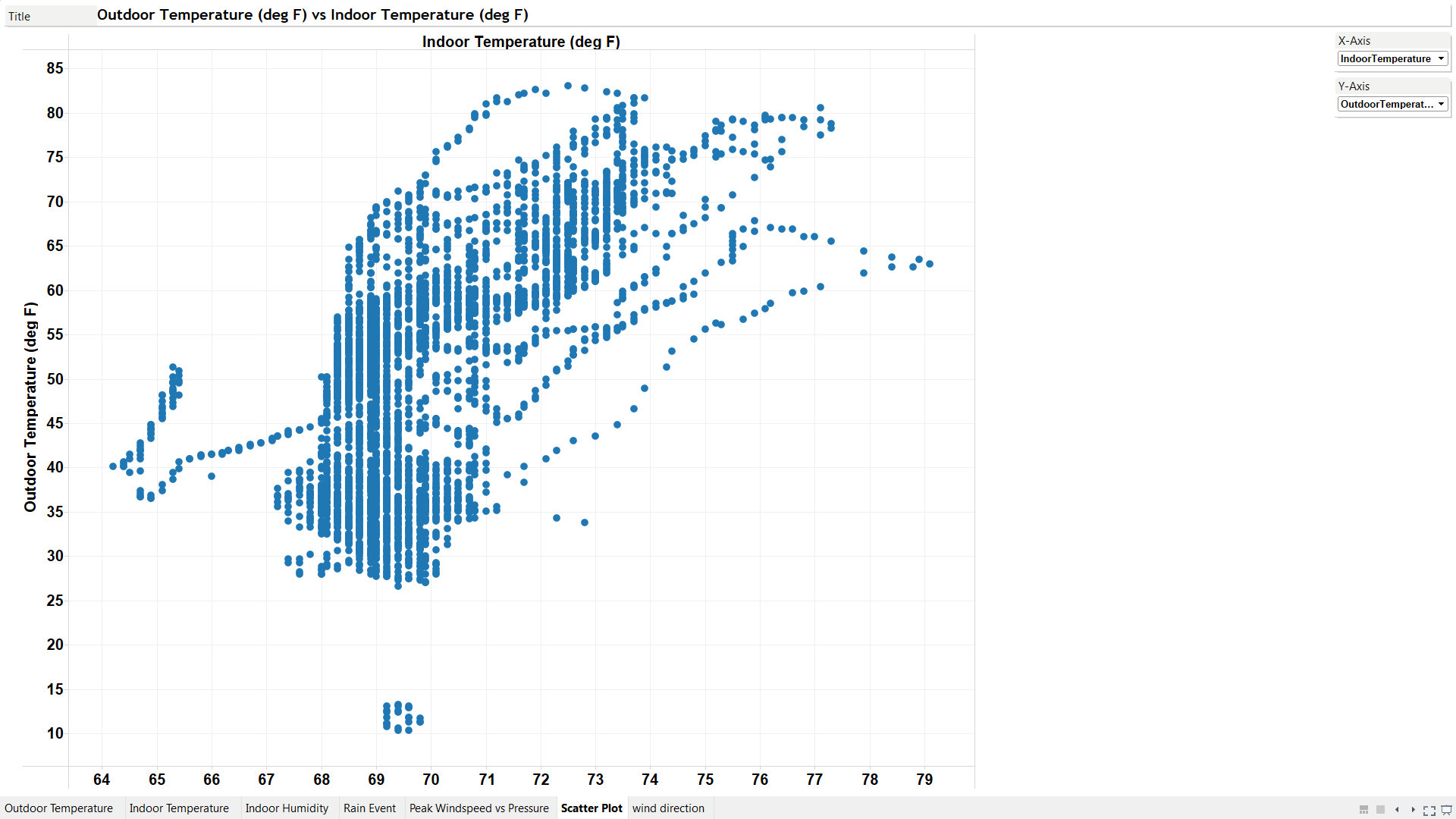
Figure 6 – Parameter driven scatter plots, here showing outdoor vs indoor temperatures.
At this point, I was feeling pretty good, almost like a real weatherman! That feeling lasted until the morning of March 21, 2016. That is the morning that reality slapped me upside the head.
Upon Returning From the Beach
On the previous night (March 20, 2016), I happened to have returned home from a weekend at the beach in the South Carolina Low County. I also happened to be wearing a tee-shirt and pair of shorts at the time I opened the car door when I arrived home. When the door was opened, I was hit with big wind gusts, cold rain and 40 degree air temperatures. It was about 6 in the evening. I made a mental note about how cold it was after having been to the beach.
The next morning, I downloaded the latest weather station data. I almost immediately recognized a big problem. Even though the interior weather station screen was reporting morning temperatures accurately (37 degrees), the downloaded data was not even close to being correct. After checking on the ability to calibrate temperature readings as shown in Figure 7, I knew I was in trouble because the weather station data appeared to be inaccurate.

Figure 7 – The ability to calibrate temperatures is limited to +/- 10 degrees, which isn’t enough for the non-linear deviations I have seen.
The Outdoor Temperature Inaccuracy
I decided to do a full quality assurance (QA) check to determine the accuracy of the Acurite weather station data. To do this, I went to the weather underground and found the nearest weather station to my house. I went through a laborious process of downloading about a weeks worth of hourly data to be used as a comparison to my data. If you want to see my real-time description of how I did this, you can watch the dorky video shown in Figure 8.
By comparing my outdoor temperature data to the weather underground data as shown in Figure 8, I can see that the Acurite weather station data is NOT ACCURATE! I also compared other variables such as humidity, and these were also inaccurate. Therefore, I conclude that the Acurite weather station data is guilty (i.e., it is inaccurate), and I cannot find a way to prove it to be innocent. I have stopped downloading the data and I only use the system to see real-time outdoor temperatures and/or other extreme weather events as shown below.

Figure 8 – Comparing the Acurite and the Weather Underground data from a nearby station. Notice the non-linear behavior of the Acurite weather station (blue line) with respect to the weather underground (orange line) . Sometimes my weather station reports higher temps and sometimes lower temps, but overall the difference between the two independent system measurements is growing over time, especially after March 17. There was also a big difference around March 15. I wonder if this a system component (i.e. sensor) malfunction, or some other problem.
The question remaining for me is this: How can the data logging system be recording numbers that are different than those being shown on the indoor screen? I wonder what data is actually being stored? This is very perplexing.
The Windstorm That Tossed and Trampled the Trampoline
A couple of days ago (April 7th), a big windstorm came and slammed our house. Jett’s trampoline got lifted and tossed across the yard like a giant 3D-frisbee. I actually saw it flying through the air. Here is some weather station information about that day.
Figure 9 shows Jett in his trampoline before the wind storm hit. It was a perfectly good trampoline.

Figure 9 – Jett and his trampoline before the winds.
Shown below is a video recorded just after the peak gusts hit, which are shown in the Figure 10 video to be 33 mph. The weather underground monitoring station also recorded a peak gust speed of 33 mph on that day. It seemed like the peak gusts were higher than that because the house felt like it was vibrating. Typically in Knoxville, there is very little wind blowing throughout the year.
Finally, Figure 11 shows the aftermath of the storm. The trampoline may be irreparably damaged.
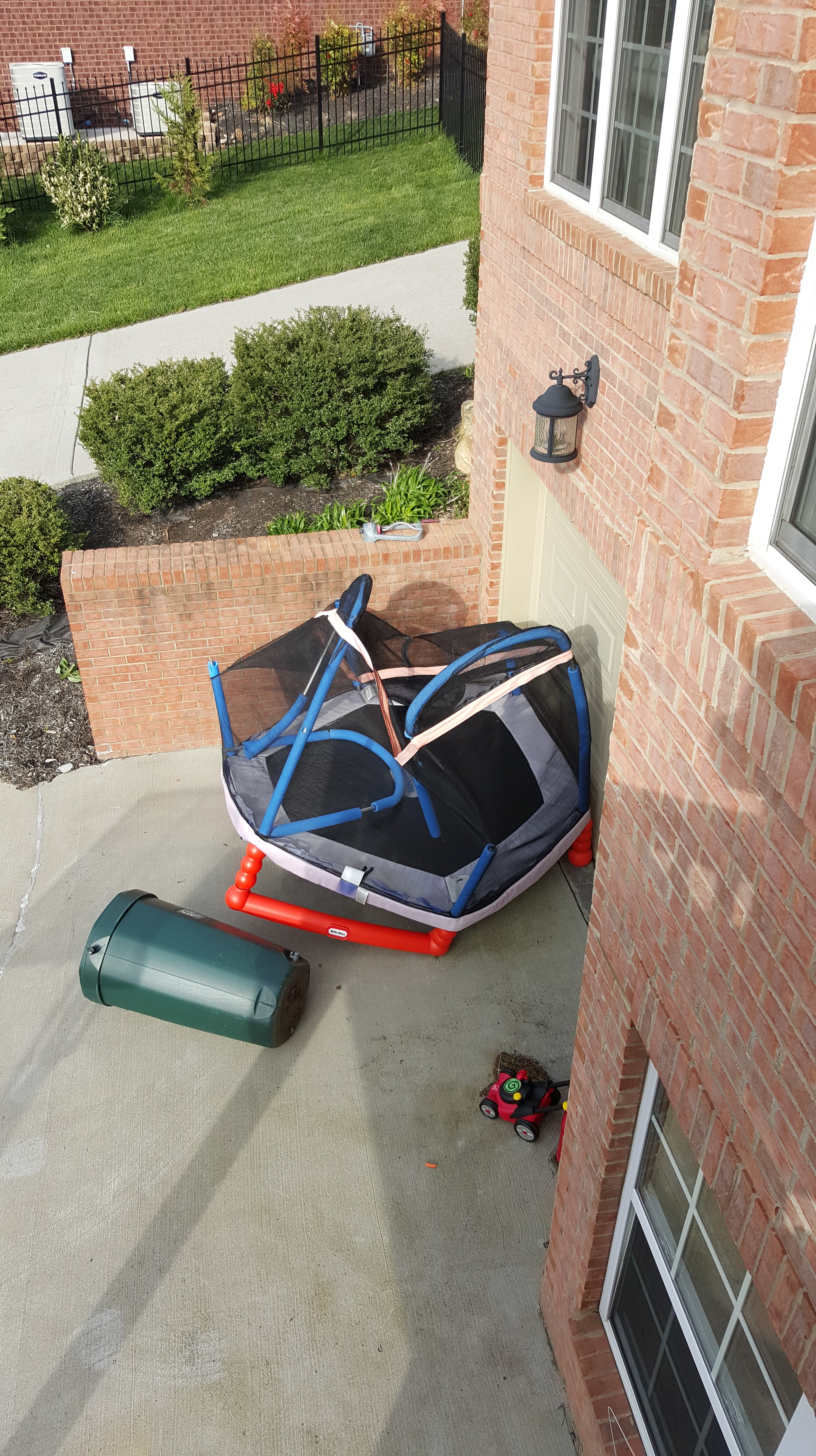
Figure 11 – The trampoline has been trampled.
Final Thoughts
If a weather station system is constructed to record and store data, how can it record such bad data? I’m considering asking Costco for a refund on this unit. I’m very disappointed, but once again, Tableau allows me to get the job done with the greatest of ease!
Update 10/26/16
I returned the unit to Costco a couple of months ago. I miss having the real-time outdoor temperatures displayed in my kitchen. Those were always accurate, as well as the indoor temperatures, ever since I installed the unit.
After watching dozens of people report problems with their units via the Acurite forum, I realized that my problems were not isolated to my unit. My problems were not due to how the unit was installed, either. If you read the comments below, George is insistent on the installation being the problem with the data that I showed in this report and he thinks I wrote this article to “sell my Tableau services”. Well, anyone who is a fan of this blog knows that I am not trying to sell services.That is simply not my mission.
Understanding data and teaching people how to comprehend data is my mission. George ignores the fact that I have multiple degrees in geology and have spent over 20 years installing environmental monitoring systems. He also ignores the fact that I am a specialist in advanced analytics. He also ignores the data shown in Figure 8. He ignores the OK correlation between the weather underground site and my unit between March 13 – 17th and then he ignores the fact that my unit went off the deep end after March 19th. To me, this appears to be some sort of system failure. Any time data begins deviating to this degree, there is a malfunction or mis-calibration, neither of which I could fix.
Even though the unit was reporting the correct temperature on the panel inside the house throughout the time frame of interest, what was being stored in the unit in the csv file was incorrect. As I stated in the article, I cannot understand how a 12-minute aggregation of temperatures around 37 degrees could be stored in the file as an average of over 70 degrees, as shown in Figure 8. Either the programming is bad or the system developed a malfunction.
I could have gone further back in time to see if my home system correlated to the data reported by nearby weather underground system. However, I didn’t have time because it took a long time for me to download page after page of weather underground data. I had enough data to know that my system developed a problem. What the problem was, I don’t know. I’ll simply get another weather station one day and return to watching the weather at my house.
George gave me a great reference today to download a Citizen Weather Observer Program (CWOP) guidance document, which I did and I read, for installing the systems. I will re-read it, understand it, and be sure to use it when I install my next system. George and I can continue to disagree on what caused my problems, but it really doesn’t matter anymore since I returned the unit. So thanks George, for helping me try to understand your point of view.
Finally, I contacted Acurite directly and asked them to send me another unit to replace the one I had. I told them I would do whatever they wanted me to do with respect to installation. I told them I would test it and write another report to discuss my findings. To this day, I haven’t heard back from them.
Next Article: A final letter to George


Ken, I really like what you have done in figure 8. You apear to be using a dual y axis line chart for your two temp data sources, but then a nifty difference bar chart synchronized on the x axis (and a extra nifty zero line indicating negative and positive differences!). Was that accomplished with a dashboard? If so, how did you allign the x axis? Can point me to a basic template that it is based on?
Hi Kirk,
Thanks for the comment. I’m going to send you a packaged workbook so that you have this example. I’m also going to add a section to the article to explain the answers to your questions. I appreciate you writing to me.
Ken
very informative,Thanks
You are welcome, Max. Hope the info helps you.
Ken
I don’t know how you expect to get good data mounting like that.
I suggest you do some research on how to properly site a weather station in order to get decent data.
Here’s a decent guide: http://weather.gladstonefamily.net/CWOP-Siting.pdf
OK George, thanks for your comment. Instead of remounting, the system was returned to Costco.
No amount of repositioning was going to change the bad programming that has been done for handling the data in that sytem. The system is flawed and it is time for you to stop trying to defend it. Use your skills to help Acurite fix it instead. That will make a bigger difference than your excuse making campaign.
Ken
Sorry, Ken. You’re just trying to sell your Tableau services. It’s pretty clear you have limited understanding on how personal weather stations work.
You can’t get good data with lousy siting
Grab a copy of the CWOP siting guidelines. Read them. Understand them. Then you’ll have decent data to analyze with your Tableau software.
Ken,
I’ve owned an Acurite system (5 in 1 Pro, model 02064-RX on the display) for about 11 months. This is the model that Costco is still selling here in Southern California. My display and remote sensor units seem to be functioning OK, but as you said, the data stored in the file on my computer is clearly not working. Numbers are stored in the CSV file, but they don’t correspond to the readings on the display or the temperatures recorded on my outside mercury thermometer. I have had no reception problems with the wireless connection (after moving to a WiFi frequency away from my neighbors and my own networks).
I have given up on the data logger function and the Internet streaming function as utterly hopeless. I think Acurite was sold a bill of goods with this system. I was convinced of this when I saw the Acurite name on $4 bimetallic dial thermometers at Home Depot. Electronic systems are not their business.
I may have been lucky to even get readings on the display, based on the problems reported on the Acurite forum. The problems I am seeing have no relation to proper siting, since the same data displayed on the inside monitor should be recorded in the computer file.
I enjoyed the analysis you provided, but without readable scales and more explanation they don’t mean much to me. I’m an engineer, used to analytical graphics, but I couldn’t correlate your graphs with your analysis. Tableau looks interesting.
Stewart
Hi Stewart!
Thank you so much for being the second person to have noticed this bad behavior. George keeps pounding me on siting problems, but that isn’t the issue. The issue is related to how they collect, collate, aggregate and store the data on the logger.
The stored data is so problematic that it is essentially worthless. No amount of calibration will fix these issues and George doesn’t want to admit to that. If Acurite hired me, I’d have their problems solved in no time at all. Wait, I can’t say that because George thinks I’m trying to sell myself! Let me rephrase, if Acurite hired any of my friends named Dudley, Ned, Joe, Mike, James, Allan, or many others, their problems would be gone in an instant.
Now regarding my failure to explain the problem I uncovered, I am going to fix that and I’m going to explain the data to you in a form that you will understand. Figure 8 is the key. It is a fancy graphic, but I’m going to simplify the story so that anyone can comprehend what happened during the time frame I showed in the article. I apologize for not being clear enough the first time, but Tableau is such a fun tool to use that sometimes it is easy to forget the KISS principle – keep it simple stupid! Please send me you email address to threedanim8@gmail.com and I’ll be sure you send you some graphics that are readable. I’ll also enable the zoom feature on the existing graphics so that the text is readable.
Thanks,
Ken
Yeah, Ken. You’re just trying to sell yourself. You don’t sound like much of a problem solver, just a shill.
Funny how the data is passing muster in CWOP and wunderground for those that site properly. Or are you going to say they are all wrong, too?
Hi George,
How do you explain my problem? The data on the display and the data recorded on the computer don’t correlate. I’m not going to try to post the data. I think the AcuRite software on the computer is faulty.