
Introduction
I recently was given a task to do some strategic and specialized geospatial work that shall remain unspecified. My initial reaction was that I would not be able to do all the work in the compressed time frame given. In fact, I did not even have a good idea how to attack and solve the problems posed.
At best I thought that I would be able to accomplish some research towards accomplishing the goals since I couldn’t immediately visualize an approach to use for the job. In some ways, this challenge surprised me because I’m a firm believer that I can do almost anything in Alteryx and Tableau.
Thanks to the incredibly powerful geospatial and demographic tools in Alteryx (and a little help from Ned), I have to admit that I was simply wrong. I was able to do the job in a couple of ways, with far greater insight and accuracy than I could have ever imagined.
Sometimes it is a pleasant surprise to be wrong, and that was the case for this task. This happens to me frequently because I am able to reach deep into my personal Alteryx & Tableau toolbox I’ve assembled and I know how to focus and concentrate on a task. I also know how to ask for help when needed, and I have learned how to construct accurate workflows to solve very tough problems.
Visualizing Population Density
The purpose of this article is not to explain the work that I did. However, one of the outcomes of the work was a very nice graphical portrayal of population density within various cities and geographical regions. The purpose of this article is to show how I used Alteryx to quantify and Tableau to visualize population density.
I experimented with a couple of different methods for calculating and visualizing population density. In the first method, irregular geographical regions were created by the method I developed for the real work I was performing. The second method involved introducing a series of regular grids onto core based statistical areas (CBAS’s) for all the metropolitan areas of the US. I used four different grid spacings including 2×2 miles, 1×1 miles, 0.5×0.5 miles and 0.25×0.25 miles. The reason I wanted to do this has to do with some other ongoing work I’m doing related to climate change.
Based on the results I achieved, I thought it would be fun to show how an Alteryx-written shapefiles can now be coupled with Tableau to create some beautiful visualizations. I previously had written a prediction that the new spatial data connector in Tableau 10.2 was going to come in handy in a lot of circumstances, and this is one of them. These results were nearly effortless to create and remind me of some beautiful, old-time mapping methods.
When I first showed some of these results to co-workers, they wanted copies of the Tableau graphics that were created so that they could print them on a large-scale plotter. That is when I knew the Tableau output was really beautiful and interesting, rather than just helping me visualize and understand the population density in various locations.
The picture gallery below includes some randomly generated graphics of population density using the different techniques. These pictures are not comprehensive but give an overview of what is possible to do in Tableau now that shapefiles are easily digested. You can click on any of the pictures in this article to see higher-resolutions versions of them.


How Dense Are We In The US Metropolitan Areas?
We are blessed in the US with large tracts of land, wide open spaces, and beautiful natural settings. When I started looking at the population density maps previously shown, I was intrigued by the wide range of population densities I was seeing, with total densities ranging from 0 to nearly 100,000 people per square mile. For this reason, I decided to take a close look at population density across the US. All results shown within this article use data definitions from 2015.
To find out which areas within our biggest cities have the highest population densities, I calculated results for all the major metropolitan areas of the US, using the 388 CBSA’s included in Alteryx. Figures 2 is the original workflow that calculated the population densities followed by Figure 3 that shows the workflow that ranked the densities and extracted the top 20 most dense locations for each of the CBSAs.
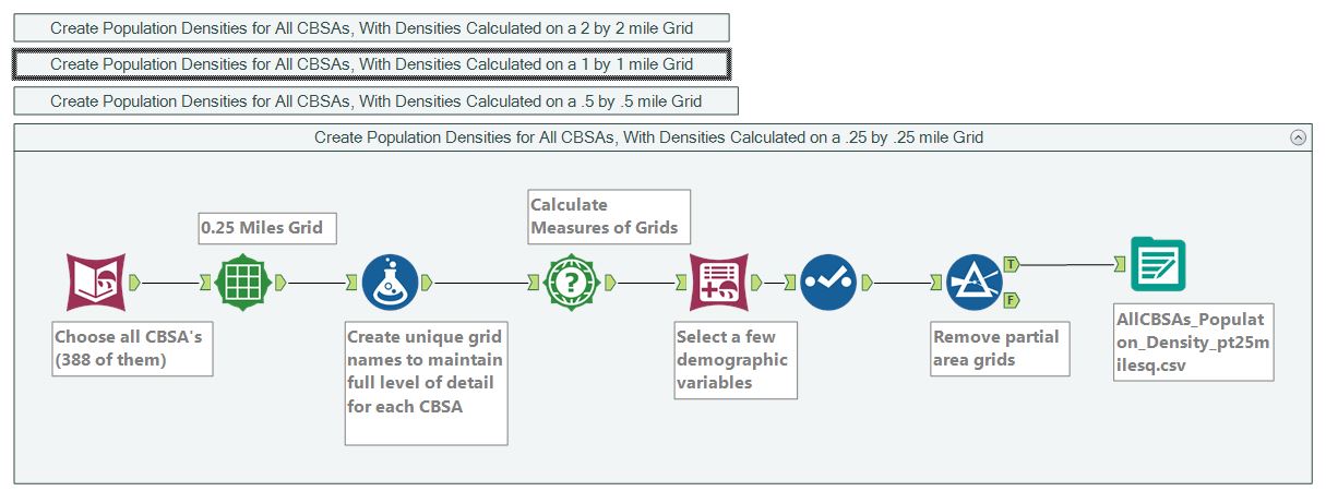
Figure 2 – The workflow to determine population densities for each grid setting

Figure 3 – The processing of the 4 gridded data sets – keep only the top 20 population densities per CBSA
In every way I have looked at calculating population density, New York is easily the most densely populated city in the US. Depending upon how much area is chosen to calculate the density (4, 1, .25, or .063 square miles) , the densities can range as shown in Figures 4 through 7.
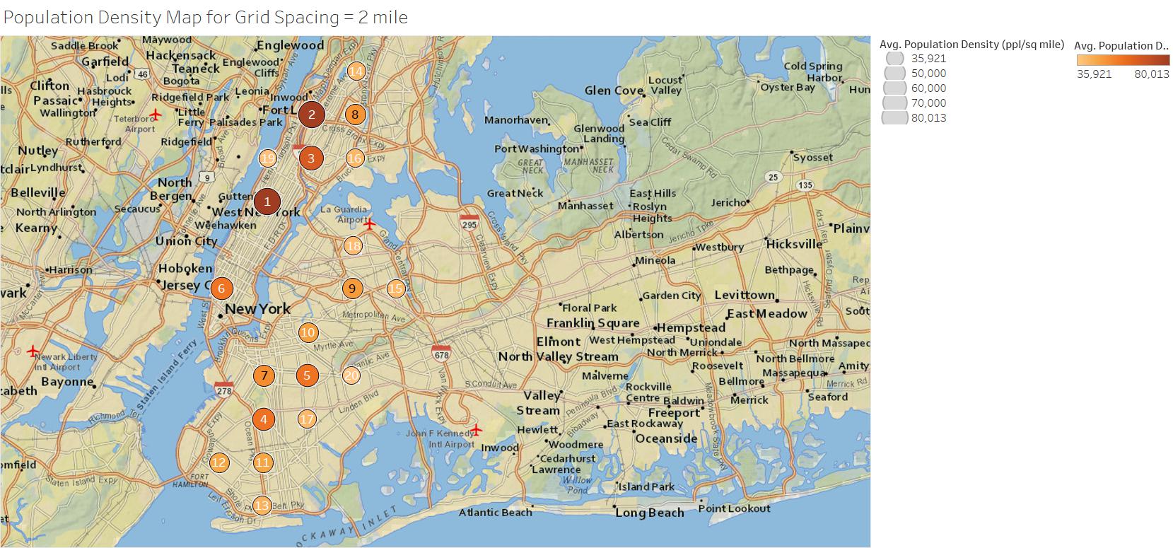
Figure 4 – The top population centers in New York for a grid spacing of 2×2 miles.

Figure 5 – The top population centers in New York for a grid spacing of 1×1 miles.

Figure 6 – The top population centers in New York for a grid spacing of 0.5×0.5 miles.

Figure 7 – The top population centers in New York for a grid spacing of 0.25×0.25 miles.
To understand this data, I created an interactive dashboard that allowed me to quickly identify the high density areas in each city and to interact with the data. I wanted to be able to visualize why the population densities were as high as they were computed. The following video explains how the dashboard works.
CBSA Based Results
I also decided to calculate a few measures over the entire area of the CBSAs. Figure 8 shows a map of population density for all CBSAs.
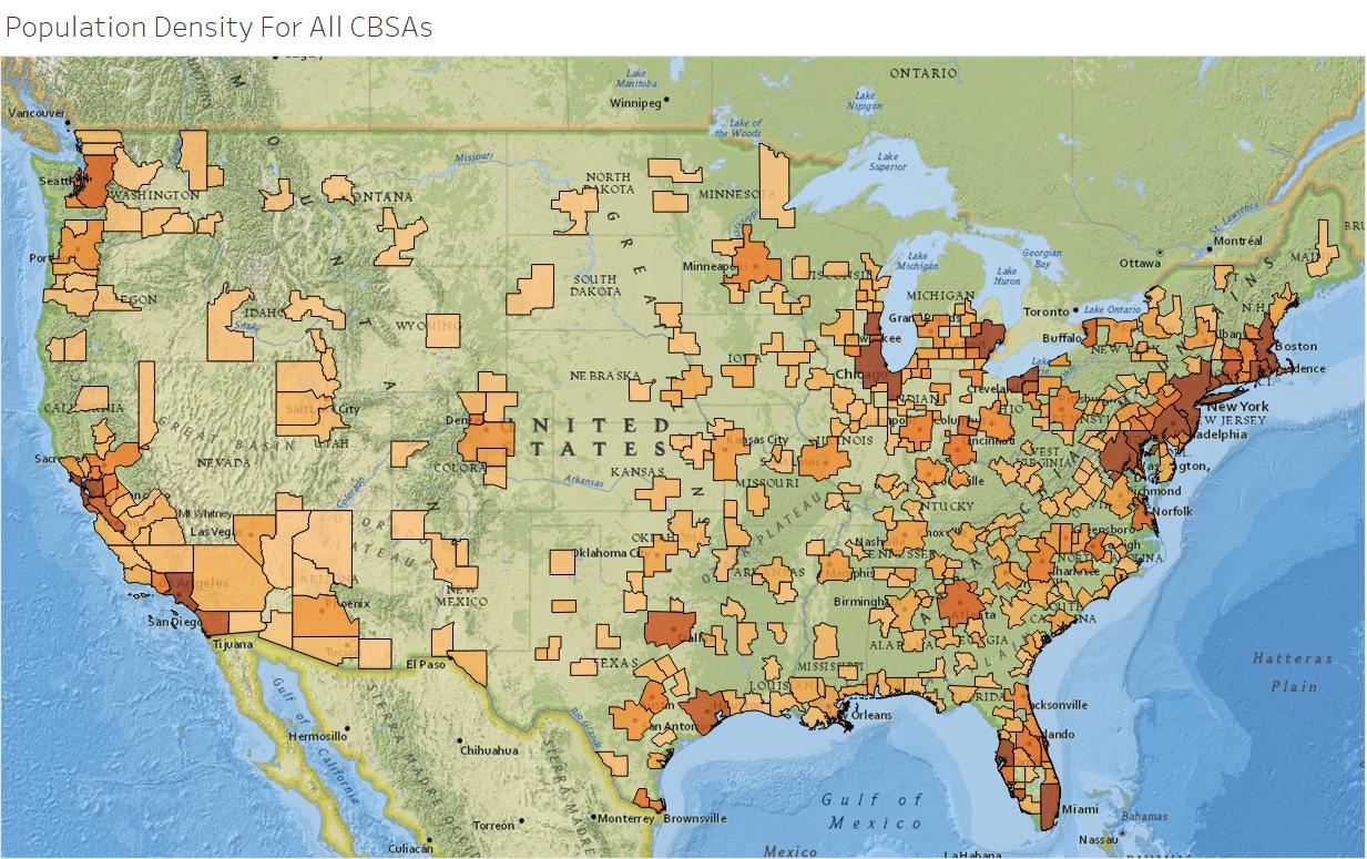
Figure 8 – Population Density (people per square mile) Over Entire CBSA.
Figures 9 through 13 show the results for the top 20 CBSA’s in five different demographic and/or geographic categories. I was surprised when LA ended up in first position for total density, but that was because its area was about one-half that of New York.
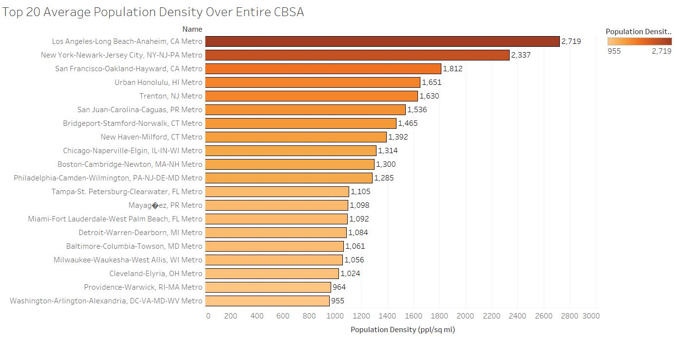
Figure 9 – Total Population Density Over The CBSA.

Figure 10 – Total Population Over Entire CBSA.

Figure 11 – Total Households Over Entire CBSA.

Figure 12 – Total Families Over Entire CBSA.

Figure 13 – Total Area Over Entire CBSA.
Final Thoughts
I wish I could talk about the other portion of this work to further explain the absolute brilliance of Alteryx in performing the calculations that were required. This combination of geospatial and demographic analysis is incredibly valuable and versatile. Unfortunately, this is one of those proprietary cases that cannot be discussed. The beautiful output of population density that was created as an offshoot of the work, however, was fun for me to share.


